The Dos and Don’ts of Website Design: Your Guide to a Beautiful Website

You deserve a pat on the back. A gold star. A round of applause.
You’ve done it! You’ve finally created your shiny new website. You’ve outfitted it with a new domain and your own unique content. Plus, you’ve tag-teamed with us, your hosting gurus.
You’ve got your site up and running, and you’re ready to bring traffic to that newly-minted .com, .xyz, or .whatever. So here’s a little food for thought: In a study, poor website design was connected directly with decreased sales. Knowing that, there’s a little more work to be done if you want to get — and keep — eyes on your site.
The key? Keep design in mind.
A well-designed website is an investment with striking returns; 38% of people will stop engaging with a website if the content or layout is unattractive. That’s a hefty chunk of your potential visitors (or customers) who will jump ship and go elsewhere if your site’s design is subpar.
So what makes a beautiful website? Well, it’s more than simply aesthetics. A well-designed site involves tailored copy, impressive visuals, and smart navigation. Incorporate these elements into your website and you’ll be setting your site up for surefire success.
Luckily for you, we’ve done some of the heavy lifting for you. We’ve crafted this handy guide of Thou Shalts and Thou Shalt Nots to guide you in the smart design of your new site. Let’s get visual.
Our designers will create a gorgeous website from scratch to perfectly match your brand.Get a Beautiful Website You’re Proud Of

1. Copy
Let’s start at the ground level. The first step in creating a well-designed website: your text. The way the text on your website looks plays into the overall design of your site, so keep eyes on your content. Readable content equals returning visitors.
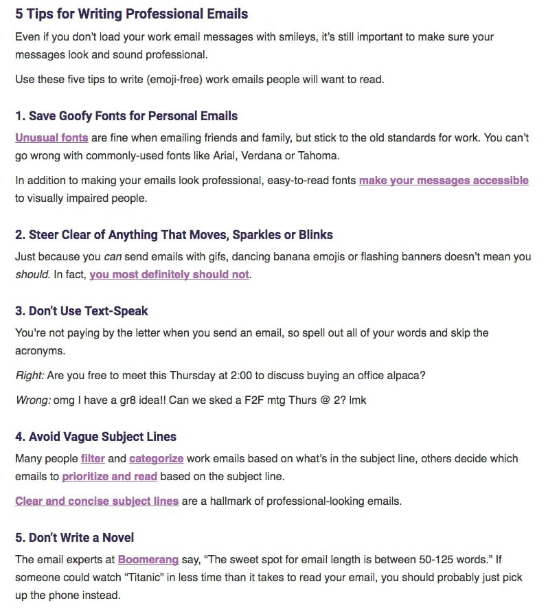
DO: Keep Copy Short and Sweet
If you think visitors are settling down on your site for a leisurely read like they do with the Sunday paper, think again.
As research shows, human attention spans have dipped to an all-time low: a measly eight seconds. With your audience in mind, craft your copy for web reading: short, easy to scan, and broken up into readable chunks. This helps with visual flow and those ever-shortening attention spans.
 DON’T: Let Your Content Go Stale
Nothing is going to turn a visitor off faster than navigating to your site and seeing old, expired content. Believe it or not, updating your site with quality content on a consistent basis means a great deal when it comes to a well-designed site.
 If you haven’t already, determine your editorial calendar and stick to it. Let your readers count on your consistent content. A beautiful website is one that is fresh with up-to-the-minute (or hour, or day) info.
Related: Keep Your Content Fresh: How to Repurpose Old Blog Posts
DO: Play Editor
In the age of spell-check, there is really no excuse for misspellings and poor grammar. No need to have an English degree; just commit to thoroughly proofreading your content before you hit publish. A handy pre-publish checklist can help with this.

Killer copywriting helps you establish credibility with your audience; error-free content keeps your site clean and professional.
And speaking of being professional, go easy with how you use capitals, punctuation, italics, even overly-technical jargon specific to your niche. Craft your copy like you’d write a résumé, not a text message.
2. Navigation
DO: Make it Quick
Reality is, web users don’t have much patience. In fact, 47% of people expect a web page to load in two seconds or less. Another nail in the coffin for slow sites: 39% of people will no longer engage with a website if it takes too long to load. An efficient site speed increases functionality and is critical to having a lightweight site that ranks highly, so every second matters.

A well-designed site is quick by nature if you’ve properly optimized your image and coded with fast speeds in mind. You can check your site with Google’s PageSpeed Insights (and Think With Google for mobile speeds) — it will provide you with a report that helps you identifies your site’s problem areas and how to fix them.
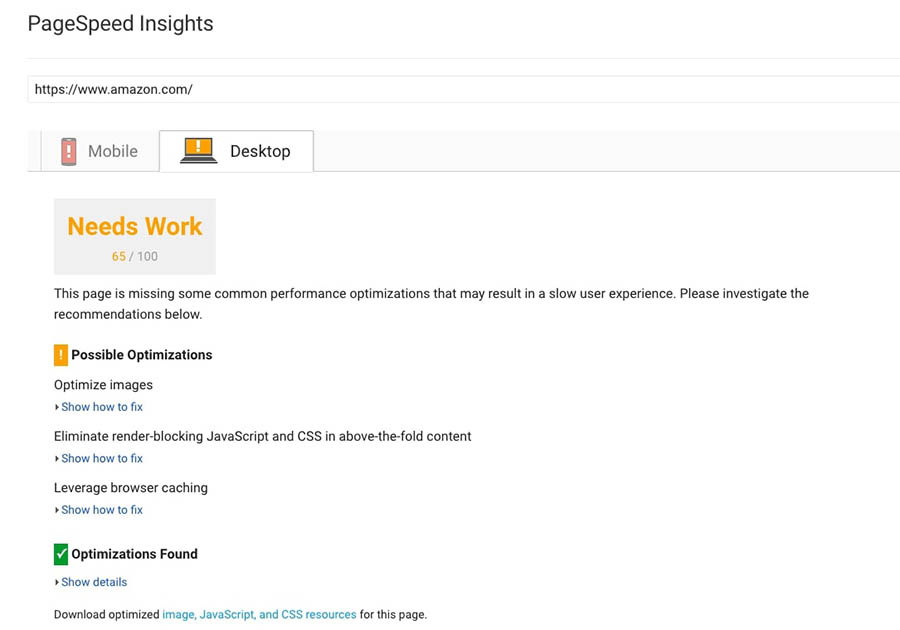
How Amazon’s load times stack up.
If you’re looking to speed things up, try these tips:
- Choose a good hosting provider (Check! We’ve got your back).
- Optimize images.
- Minify your resources like JavaScript and CSS.
- Leverage browser caching. If you’re using WordPress, you can use a handy plugin, or utilize our services.
- Get rid of outdated or unused plugins.
- Utilize expire headers.
- Enable CSS sprites.
A swift, seamless site is essential for a well-designed website.
DON’T: Ignore Hierarchy
Part of a well-designed website is structuring your layout in such a way that eyes are naturally directed through your content in an organized hierarchy. This helps readers understand how your content fits together and know where to scan.
There are a few things to consider when designing your web’s hierarchy. One is basic: on web or paper, we like to read left to right and from top to bottom. A design that goes against those normal patterns of behavior will present a learning curve for your visitors. Well-designed websites are typically laid out in this corresponding “F” reading shape.
Additionally, eye-tracking studies show there is science involved in how readers scan your site. Enter: Fitt’s Law. Simply put, you should give visual weight — typically distinguished by size or color — to the things you want to emphasize, like your call-to-action buttons and key content.
Also, the law applies to the efficiency of clicks between two spots; your design should reduce the amount of time it takes for users to get to frequently-used targets.
You also should consider another useful design element: a footer. While it’s situated at the bottom of your site — and your hierarchy — footers offer a visually logical conclusion to your site and provide points of contact that your menu may miss. Plus, they get viewed more often than you might think — and can help increase conversions.
Above all, direct the flow of your site in a clear, logical way using a smart and focused hierarchical structure.
Related: Take Your Content Strategy Up a Level with a Content Audit
DO: Remember Usability
A beautifully-designed doesn’t do a lot of good if it lacks functionality. The design of your site should be logical, and easy to use; if your user has to think too hard or navigate a labyrinth to find what they’re looking for, you’ve got problems.
Usability contributes greatly to a well-designed site, but having a clean, professional site design doesn’t have to be complicated. While the type of business or brand you run may determine the layout of your site, you don’t want to sacrifice usability or credibility by setting up an overly fanciful or complicated site. You don’t want visitors to need an instruction manual when trying to access your content. In fact, on a beautiful web page, your design shouldn’t draw attention to itself; it plays a crucial — albeit behind-the-scenes — role.
A few things you do need for increased usability:
- A clear, easy-to-navigate menu with — at the very least — designated Home and Contact buttons (51% of people think “thorough contact information” is the most important element missing from many company websites.)
- Mobile responsiveness (see our extended argument below)
- Accessibility across browser types
- Optimal load times
What works best for users as they interact with web pages may change over time, so analyze your site’s usability often and be conscious about meeting their navigational expectations and playing to behavioral conventions.
Returning to the mobile conversation, consider these numbers:
- Between December 2013 and December 2015, smartphone internet consumption grew by 78%.
- Mobile devices now account for nearly 2 of every 3 minutes spent online.
- 40% of users will choose a different search result if the website they navigate to isn’t mobile-friendly.
- 83% of consumers report using more than one screen simultaneously.

So not only does your site have to look sharp on a desktop, it’s got to be well-designed on each screen, i.e. responsive.
Usability across devices is essential for good business: 40% of people will choose a different search result if the first is not mobile friendly.
You can use Google’s Mobile-Friendly Test to try out your site.
Related: Leveling the Web: 12 Questions with Accessibility Expert Gian Wild
3. Visuals
Once you’ve got pristine copy and clear navigation, it’s time to think about your site’s outfittings. The way your site communicates a message, good or bad. Give your design a facelift, and you could see increased traffic, sales, and a loyal readership.
DO: Mind Your First Impression
First impressions matter — a lot. Don’t believe us? Research shows that once site loads, users form an opinion in .05 seconds. If your site isn’t in tip-top shape, you can wave goodbye to your readers. Fast.
What’s more, 48% of people admitted that a website’s design is the number one factor in determining the credibility of a business.
A lot is riding on those .05 seconds, so put your site’s best (virtual) face forward.

What’s the quickest way to look like a web-owner amateur? Well, unless you want your website to look like it’s stuck in the internet’s stone ages, avoid blinking or flashing text, an excess of animations, pageview counters, or tacky fonts or color schemes.
If you’re not a graphic or web designer, it’s a good idea to review a few fail-safe principles of design that apply both on the web and on paper. Things like contrast and proximity go a long way to making your site more visually appealing.
Now, let’s talk type.
Typography is more than just choosing an aesthetically-pleasing font. Type is an important part in establishing hierarchy as it guides readers through various parts of your site and helps create the feel of your brand. (And a lot of brands are recognized simply by their fonts!)
Plus, typography contributes largely to your overall design and how it’s received and engaged with; meaning: your typography can really make or break your site’s conversions. You want people to act, buy, subscribe, return, or share? Choose type wisely.
That being said, a few type best practices: It’s smart to choose a maximum of three fonts and strategize optimal font pairings. Typecast or Typetester can help you choose fonts for your site. Keep in mind that sans-serif fonts (typefaces without the flourishes on the end of a letter’s strokes) are typically better for web-reading.
And a word (or two) on colors.
Be conscious about the colors you choose; a smart color palette can enhance the experience users have on your site and be used as another tool for establishing visual flow. Remember color theory? A super-fast refresh:
- Contrasting colors help organize and divide elements on your page.
- Warm colors spark excitement.
- Cool colors calm and relax.
Knowing this, you should plan out your site’s color scheme to best fit your brand and guide visitors through your site. The Adobe Color Wheel can help you plan.

DON’T: Fear White Space
Like Taylor Swift, humans are typically wary of blank spaces. Our minds scream, “Fill it! Fill it!” And that is how you end up with a cluttered mess.
In your site’s design, blank space is good. Very good. Rather than being wasted space, white space is a design element that helps guide the visual flow of your website and establish the priority of content. Plus, it gives much-needed relief to your readers’ eyes and brains.
Utilize white space around columns, between graphics, and along the margins to give structure and help readers understand how your content fits together.
DO: Tidy Up
Nothing like web clutter to make your site a big whomp, whomp, whomp.
Designing a website is not like cutting out pictures from a magazine and gluing them on paper, collage-style. An appealing website is clean and structured, organized and purposeful. Our motto here: less (really) is more.
A few housekeeping rules:
- Watch out for dead links. Update or remove them ASAP.
- Refresh old or outdated content.
- Keep an eye on analytics and repair problem areas.
- Optimize images and provide alternative text for each.
- Clean up categories and tags as your site grows.
- Review your search engine optimization (SEO) strategy and internal linking structure.
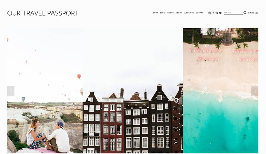
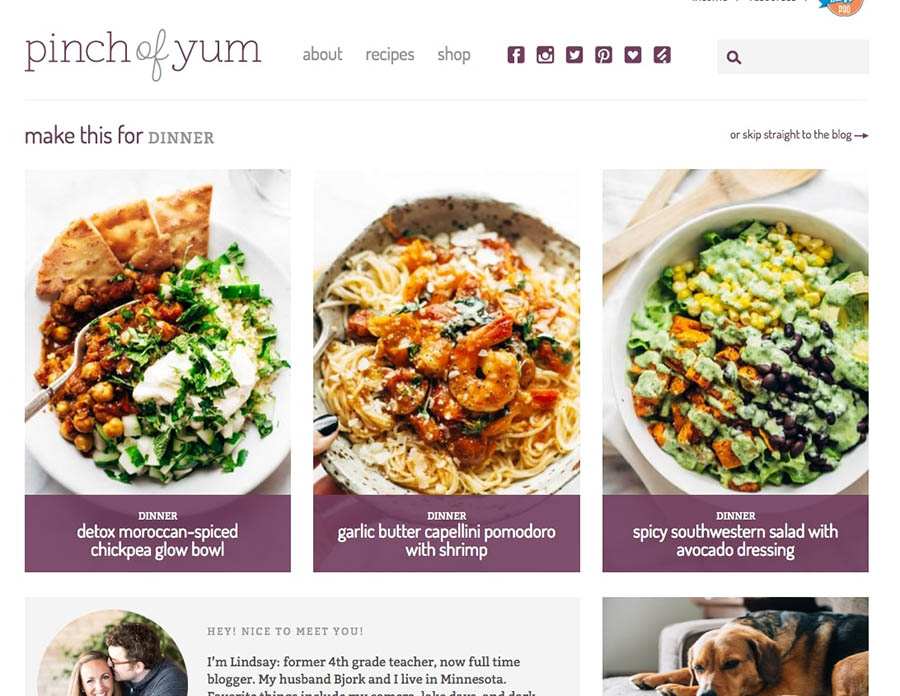
DO: Learn From the Best
You want your site’s design to represent your brand well. But there’s nothing wrong with looking at some of the web’s best to draw ideas and inspiration from the sites that utilize the principles of web design well. Time for a few gratuitous glances.
DO: Give it a Test Drive
Good site design — like most other things — involves a lot of trial and error to perfect.
Once you’ve cleaned up your site and implemented new elements of design, preview it on different devices. Check it (maybe with another trustworthy pair of eyes) for any glaring design or navigation issues. You want it thoroughly examined before meeting the browsers of your readers.
Test, test, test. That’s your motto. (Should we make t-shirts?)
Try utilizing a service like Nibbler, which will give you insights on how to improve your site in a number of different areas, like code quality, internal linking, social interest, and mobile optimization.
Get Content Delivered Straight to Your Inbox
Subscribe to our blog and receive great content just like this delivered straight to your inbox.
Wrapping Up
You’ve worked hard to get your new site off the ground. Kudos from us to you!
Don’t let readers slip past your web offerings by living beneath your web’s true design potential. With an eye on visuals, text, and navigation, you can get eyes on your content — to stay.
A beautifully-designed site is only a few clicks away.