30 Excellent Product Landing Pages Guaranteed to Inspire You

As an e-commerce business owner, you promote your products or services in ads, social media posts, or emails. Often, you’ll focus on driving traffic to your website, where the majority of your new customers are acquired. However, if you’re driving all that traffic to poorly designed product landing pages, you may be missing out on some serious sales.
Fortunately an effective, conversion-optimized product landing page is within reach! You’ll turn more visitors into customers by including things like a catchy headline, high-quality images, and call-to-action buttons.
In this post, we’ll explain what a product landing page is and how to create one. Then, we’ll showcase 30 excellent product landing pages guaranteed to inspire you and help you on your journey to becoming master of your ecommerce conversion rate.
Let’s get started!
What Is a Product Landing Page?
Put simply, a product landing page is a valuable tool designed to promote and sell a particular product or service. Once visitors click on a link to this web page, it will leave a first impression of the item and encourage them to purchase it.
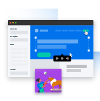
A landing page is a singular web page that typically serves a unique marketing objective. For instance, this page may be designed to support e-commerce transactions, capture email leads, or communicate a ‘coming soon’ message.Landing Page
You may be wondering how product landing pages differ from product pages. Although both can promote products, landing pages are optimized for conversions. They usually remove menus, unrelated content, or links to other pages on your website.
You can include links to your product landing pages in paid ads, email newsletters, or social media posts. When users visit the page, they’ll see a conversion funnel for whichever product you’re trying to sell.
Here are just a few items you could promote on a product landing page:
- Physical products from your online store
- Digital products such as e-books or online courses
- Subscriptions for your membership site
Ultimately, the goal of a product landing page is to increase conversions. There are many different ways to do this, but let’s discuss some best practices when creating your product landing page.
How to Create the Perfect Product Landing Page
When designing product landing pages for your online store, it’s important to focus solely on selling your product. While lead generation landing pages might aim to gain new sign-ups, product landing pages should highlight a specific item’s main features and selling points.
To help you get started, here are our tips for creating a well-designed product landing page:
- Keep it simple: A landing page should focus on a single goal, such as making a sale or capturing a lead. Avoid distracting the visitor with unnecessary links or information.
- Use high-quality images: Whether you’re promoting a physical product or digital item, any photos should be attractive so that visitors want to make a purchase.
- Use Video: The video should be well produced and effectively communicate the value proposition and call to action. Studies show that including a video on a landing page can lead to a 2-3x on conversions compared to a landing page without video.
- Add a catchy headline: Since headlines are the first thing visitors will see on your product landing page, make sure to grab their attention immediately.
- Have a compelling value proposition: Explain to your visitors why your product or service is clearly the best solution to their problem or need.
- Feature social proof: Often, shoppers want to see positive reviews and customer testimonials before buying your products.
- Include a Call to Action (CTA): To encourage visitors to become customers, you can include CTA buttons in multiple places on the product landing page.
- Whitespace: Use whitespace to create hierarchy, improve legibility and separation. Orderly and consistent alignment can create a sense of balance and organization.
- Typography: Take into consideration your choice of font families, sizes, line spacing and font colors. Ensure that the visitor can easily read and understand the information.
- Use a color scheme: A color scheme can evoke different feelings, moods and emotions, that creates a certain atmosphere. Start off with a limited and cohesive palette that reflects your product or service’s value and identity.
Although these elements are often included on product landing pages, you have a lot of design freedom. Ultimately, you’ll need to consider your brand and the product you’re promoting. This will help you create a landing page that highlights your main selling points and leads to a high conversion rate!
Get Content Delivered Straight to Your Inbox
Subscribe to our blog and receive great content just like this delivered straight to your inbox.
30 Excellent Product Landing Pages to Inspire You
Before you start building your first product landing pages, you’ll probably want some inspiration. To help you get started, here are some of the best product landing page examples!
1. Bellroy
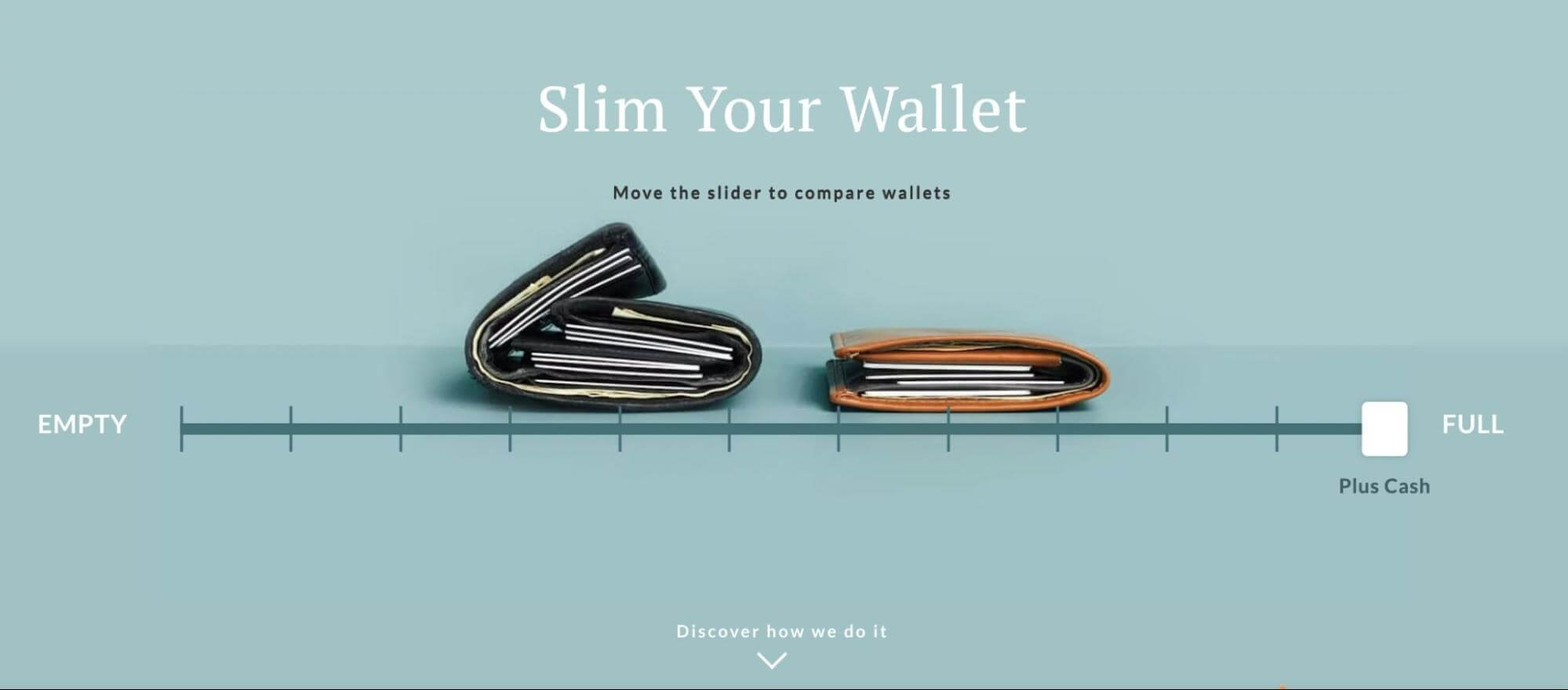
What makes this a good product landing page?
- Bellroy’s main selling point is its slim wallet. The product landing page includes a slider that compares the Bellroy product to traditional wallets to advertise this feature. Placing this interactive animation at the top of the page can effectively hook new visitors.
- The slogan “The same capacity, without the extra bulk” immediately explains the product’s purpose.
- After the promotional material, Bellroy makes it easy to buy its wallets. Plus, these are organized into different types. Based on what customers carry daily, they can choose and purchase a wallet that meets their needs.
2. Copper Cow Coffee
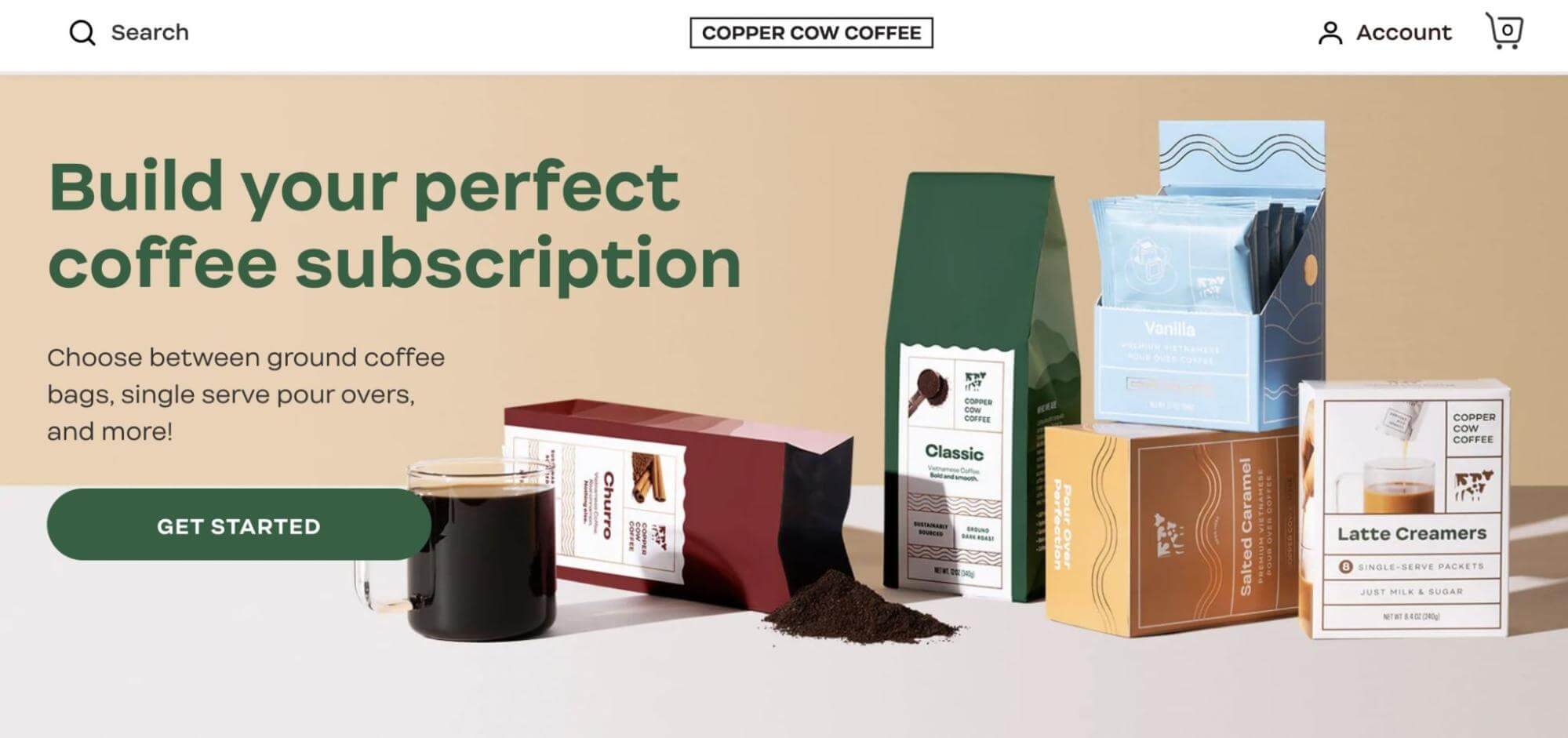
What makes this a good product landing page?
- This product landing page starts with the action phrase “Build your perfect coffee subscription”. With this simple sentence, Copper Cow Coffee establishes who its target customers are and how they can benefit from these products.
- Rather than promoting single bags of coffee, Copper Cow Coffee is promoting a subscribe-and-save option. Since this comes with a discount and delivery convenience, it can lead to more conversions.
- Copper Cow Coffee is also transparent about what is included in each product box. Plus, new customers can create custom coffee boxes.
- If visitors are still deciding whether to buy this coffee, they can read testimonials from satisfied customers.
3. Apple Airpods Max
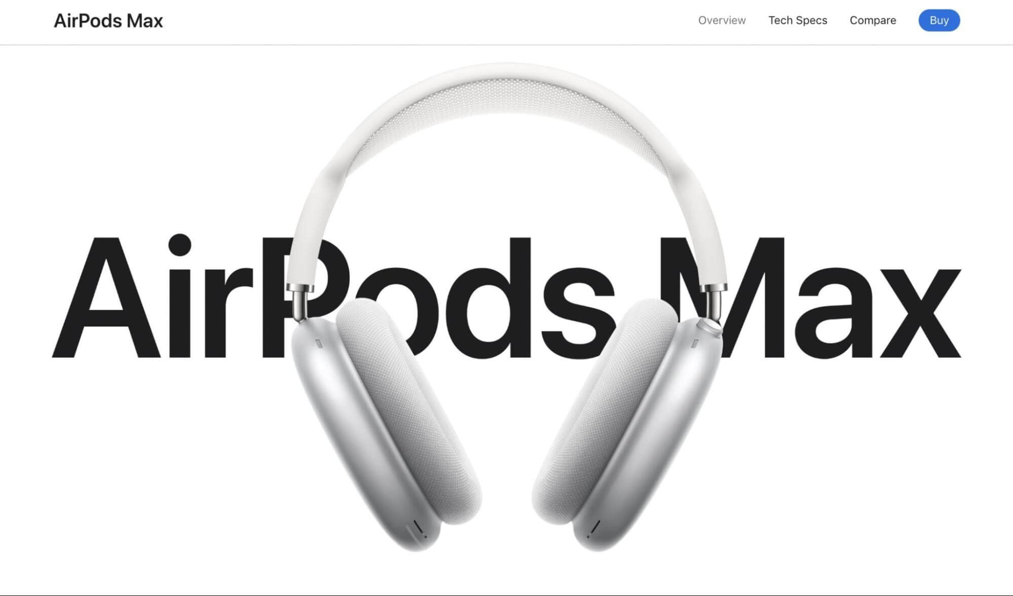
What makes this a good product landing page?
- What makes Apple stand out from other brands is its stunning visuals. The company showcases the AirPods Max headphones throughout this product landing page with aesthetic and engaging graphics.
- Apple includes close-up videos of the product so that visitors can see the quality for themselves — paired with descriptive text, the media fully encompasses all the features of the AirPods Max.
- The page primarily uses a simple black-and-white color scheme. It makes the product’s colors pop, drawing attention to its design.
- Even as you scroll through the product’s features, the sticky header stays at the top of the page. This makes it easy to buy Apple headphones at any time.
4. Maserati MC20
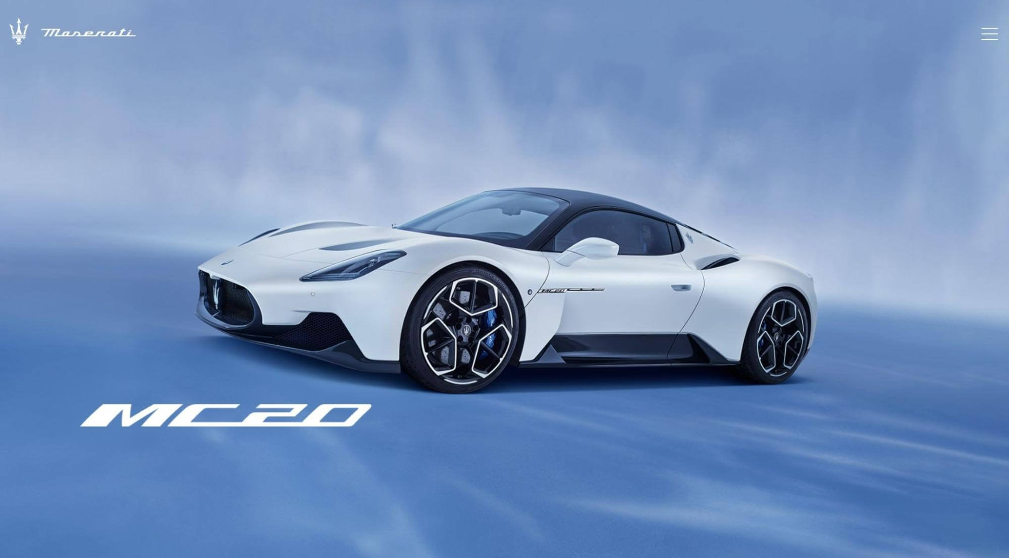
What makes this a good product landing page?
- The Maserati MC20 is a luxury car which is conveyed right from the start. This landing page lets the product speak for itself by including high-quality images of the exterior, interior, and engine.
- One of the best features of the new Maserati is its speed. Visitors can press and hold the spacebar to simulate the car’s power. This will take them from 0 to 100km/h while watching a speedometer and hearing sound effects.
- By clicking on Shopping Tools in the footer, potential customers can start building their first Maserati MC20. Alternatively, they’ll be able to find dealerships and schedule test drives.
5. Absurd Design
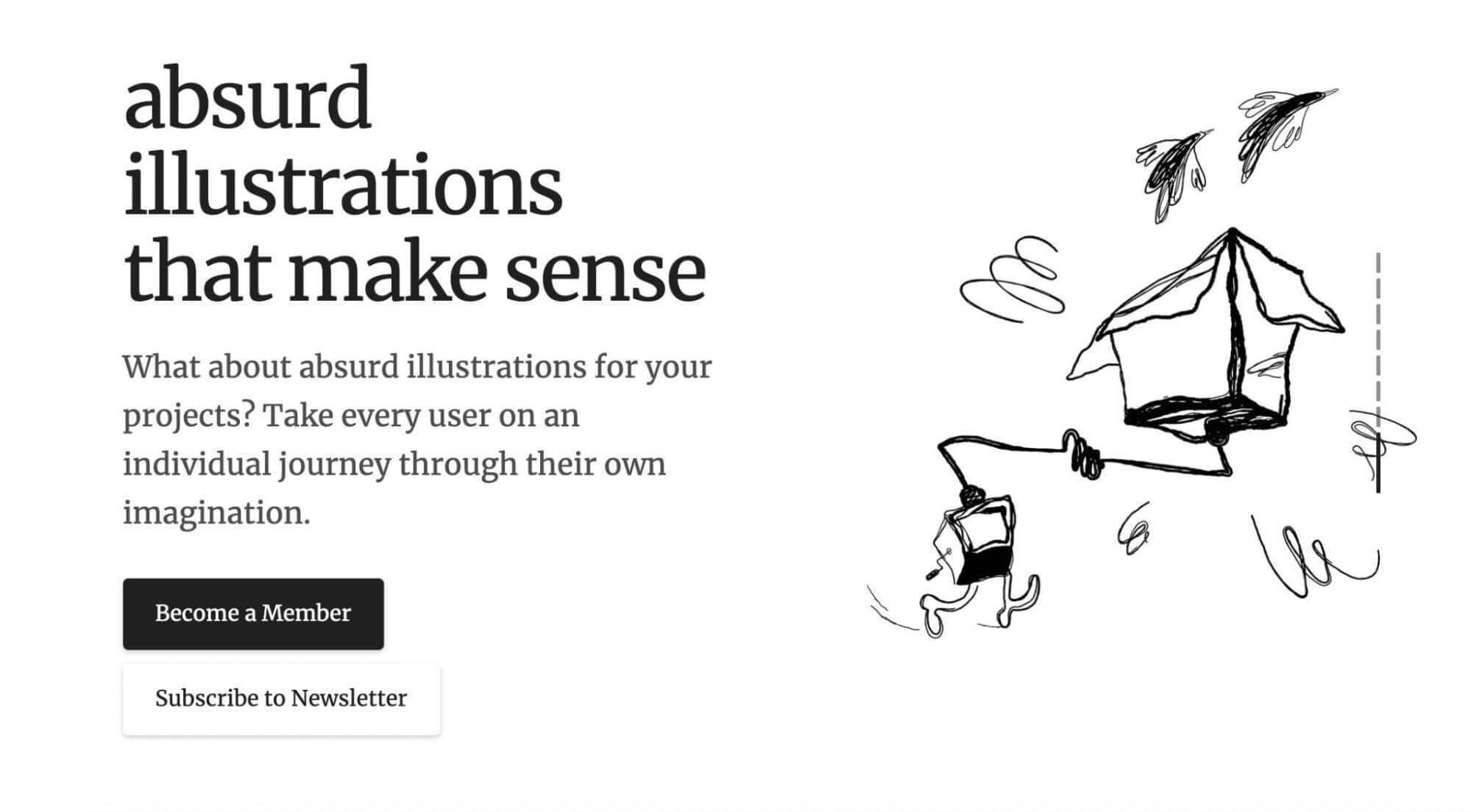
What makes this a good product landing page?
- Absurd Design was created by an independent artist who wanted to add a creative, human touch to any project. So, it makes sense that this landing page features unique and expressive artwork. This adds to the attractiveness of the web design while promoting the service.
- There is a portfolio of commissions from previous clients. It portrays the design services in many different ways.
- Absurd Design incorporates multiple calls to action on this landing page. Instead of promoting a physical product, it encourages visitors to become a member to see the new artwork. Plus, the creator adds a sense of urgency by saying there are not many seats available.
6. Square
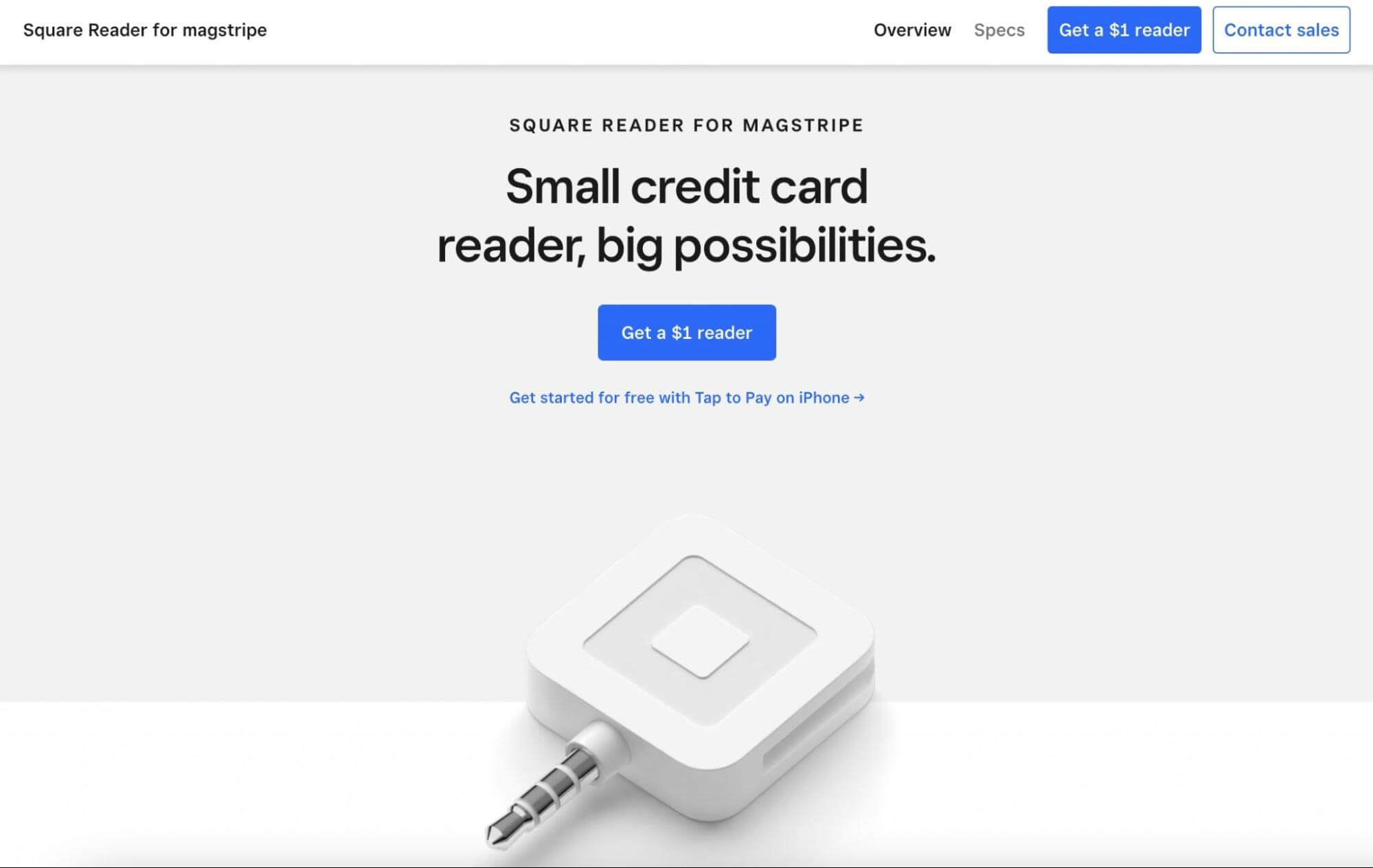
What makes this a good product landing page?
- With a more minimal design and color palette, Square provides a professional landing page for its square reader. Limiting flashy elements allows visitors to focus on the product and its main features.
- At the top of the page, Square draws in new customers with a simple but clear headline. The call-to-action button also includes transparent pricing to encourage conversions.
- This product landing page features many high-quality images of the Square reader being used. New visitors can see its size and how it will work with different devices.
- To ensure every question is answered, the bottom of the page includes a Frequently Asked Questions section.
7. Draggable
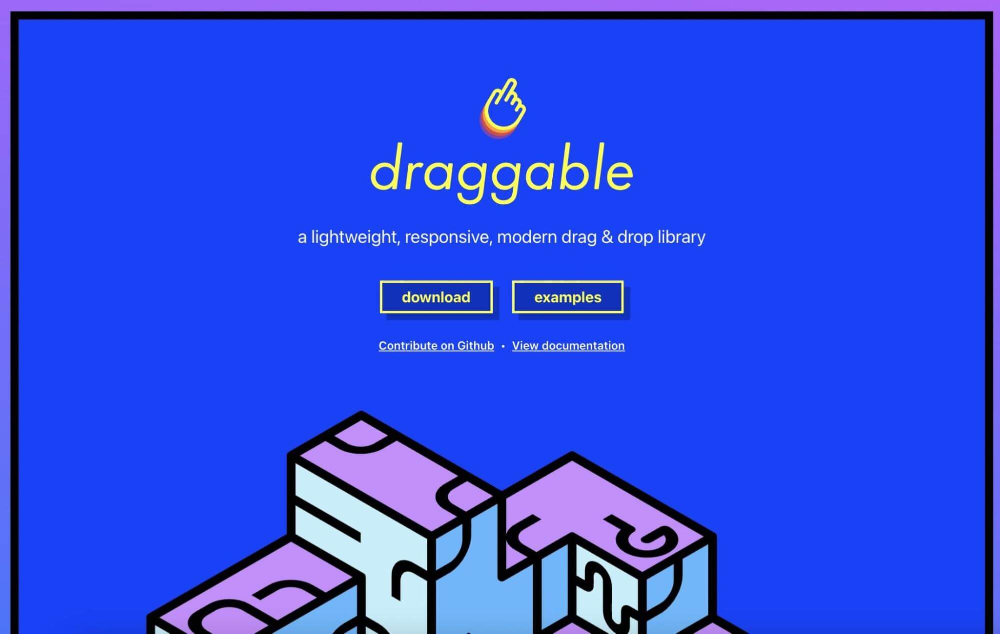
What makes this a good product landing page?
- Draggable has a simple but highly effective landing page for its product. To explore its drag-and-drop JavaScript library, you can physically drag and drop different design elements on the page.
- All of Draggable’s features are shown with unique animations. For example, customers can trade different elements in the Document Object Model (DOM). Underneath this feature, the designers have enabled visitors to rearrange different building blocks.
- Plus, it’s easy to start using Draggable. New customers can simply click on the Download button. If visitors need further convincing, there are also links to documentation and excellent examples of the product in action.
8. Orangina
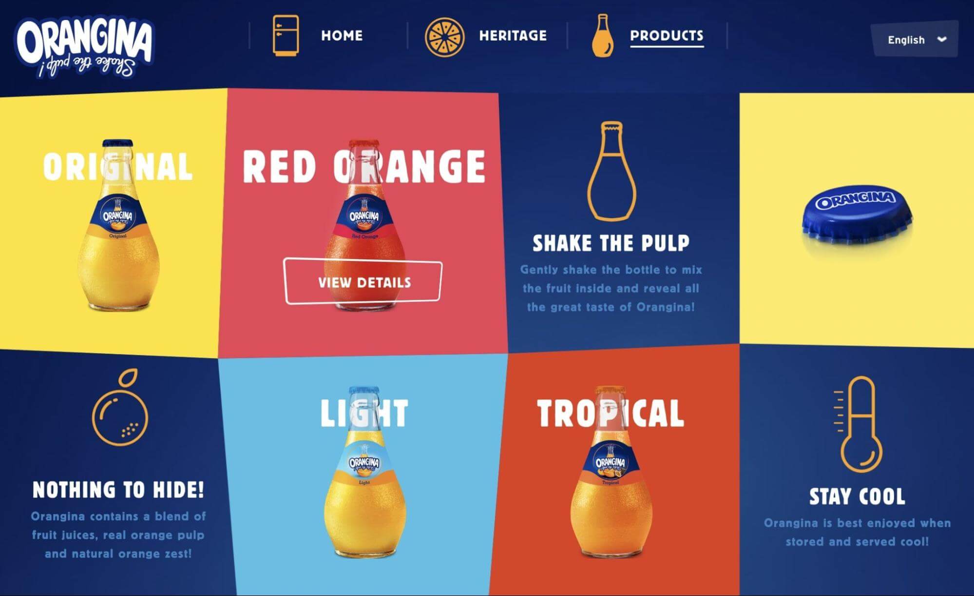
What makes this a good product landing page?
- Orangina rejected the typical landing page format and placed all the information above the fold. Instead of having to scroll through a lengthy page, visitors can immediately see the company’s different products.
- Orangina included all the different flavors of fruit juices in a grid. After hovering your mouse over a specific product, you’ll see an animation with an action button to see more details.
- Potential customers can also see the company’s core values. By advertising that every product contains real fruit juice, Orangina reassures visitors that they’re receiving a high-quality drink.
9. Helix Sleep
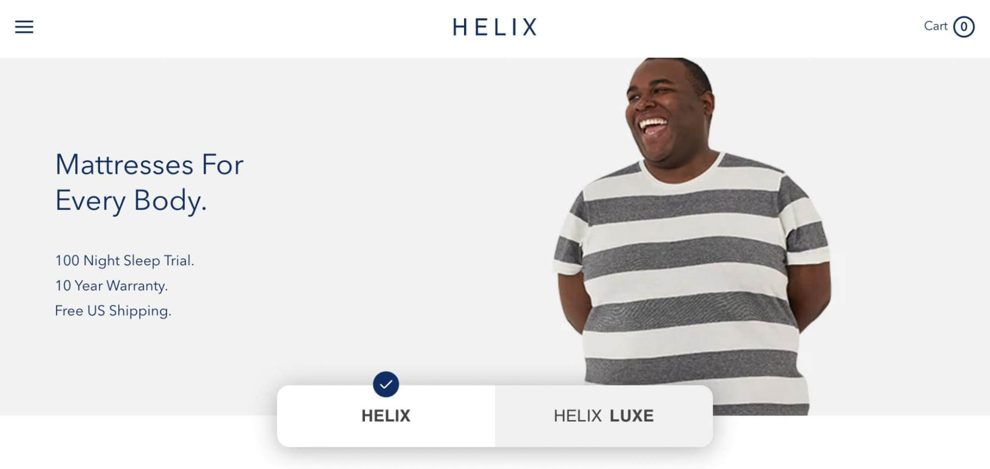
What makes this a good product landing page?
- This product landing page starts with the headline “Mattresses for every body”. It immediately tells visitors that they can find a mattress that suits their sleeping needs.
- Although Helix makes many mattresses, they’re organized by firmness. As a result, prospective customers can choose between soft, medium, and firm feels. Helix also recognizes that taller people and children will need more specific options.
- Helix includes a link to a sleep quiz to enable visitors to find the right type of mattress. It can prevent customers from having to return products.
10. Cowboy 4
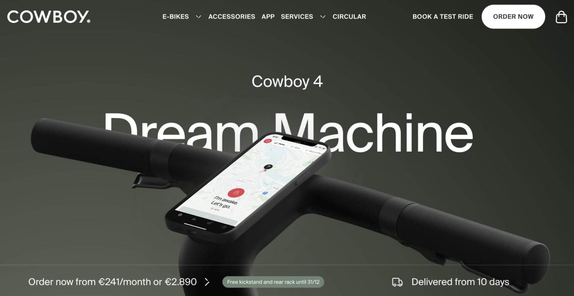
What makes this a good product landing page?
- When visitors click on this landing page, the Cowboy 4 is shown in a high-resolution video. As you scroll, you can see close-up perspectives of specific features like the gears and the removable battery.
- One of the main selling points is the bike’s compatibility with phones. Therefore, Cowboy shows the wireless phone charging and the app integration in many images. New customers can see how this bike makes navigation easier.
- Cowboy also offers a free test ride to try out the bike before buying it. This CTA is shown throughout the page, as well as in the header and footer.
11. Daily Harvest
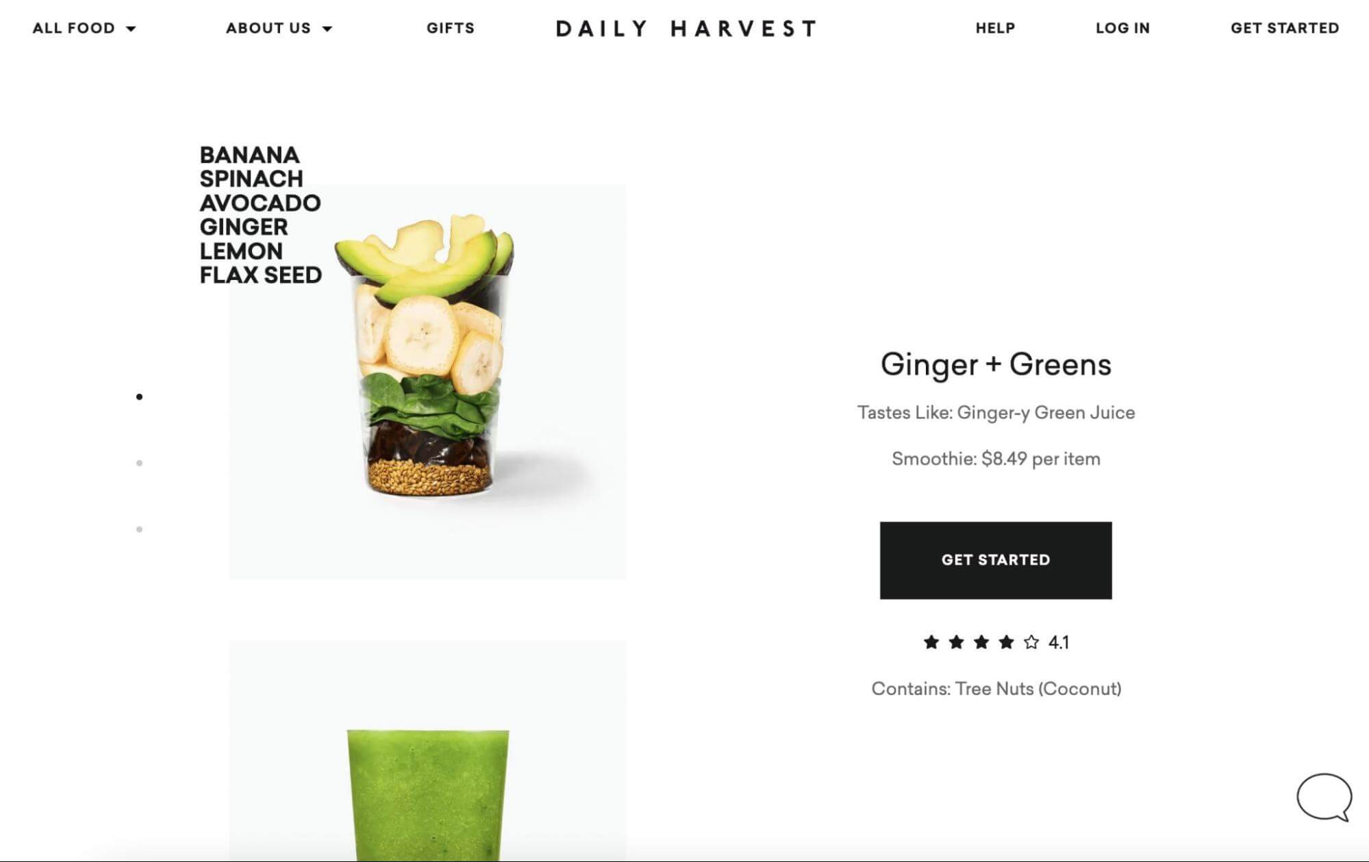
What makes this a good product landing page?
- Another minimal product landing page is from Daily Harvest. This company showcases simple and bright photos of its ginger and greens juice blend. Plus, customers can see the individual healthy ingredients before they’re blended.
- To promote healthy living, Daily Harvest is transparent about product ingredients. Along with this list, there’s information about how each ingredient tastes, as well as its nutritional value.
- New customers can decide whether to buy this product based on the reviews. This section will show star ratings and tips from other customers.
12. Oura Ring
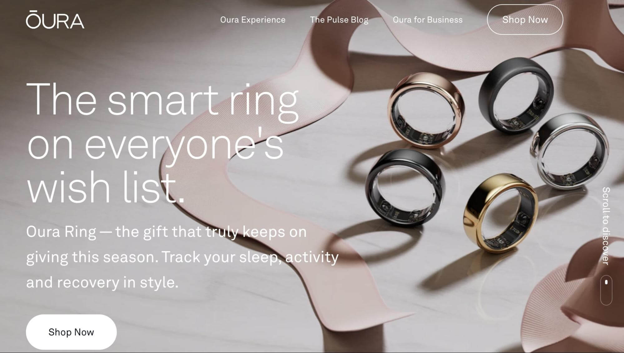
What makes this a good product landing page?
- When designing your product landing page, you’ll want new visitors to know what your product is and what it does. Oura Ring does this successfully. From the get-go, visitors understand that these smart rings can monitor their health and fitness.
- Oura Ring’s audience will likely wonder how these rings can benefit their daily lives. This landing page answers these questions by including detailed statistics about how current members improved their health.
- Finally, Oura Ring recognizes its competitors. On this landing page, there is a note that heart rate is more accurately measured from the finger rather than the wrist. This data differentiates smart rings from smartwatches.
13. Recess
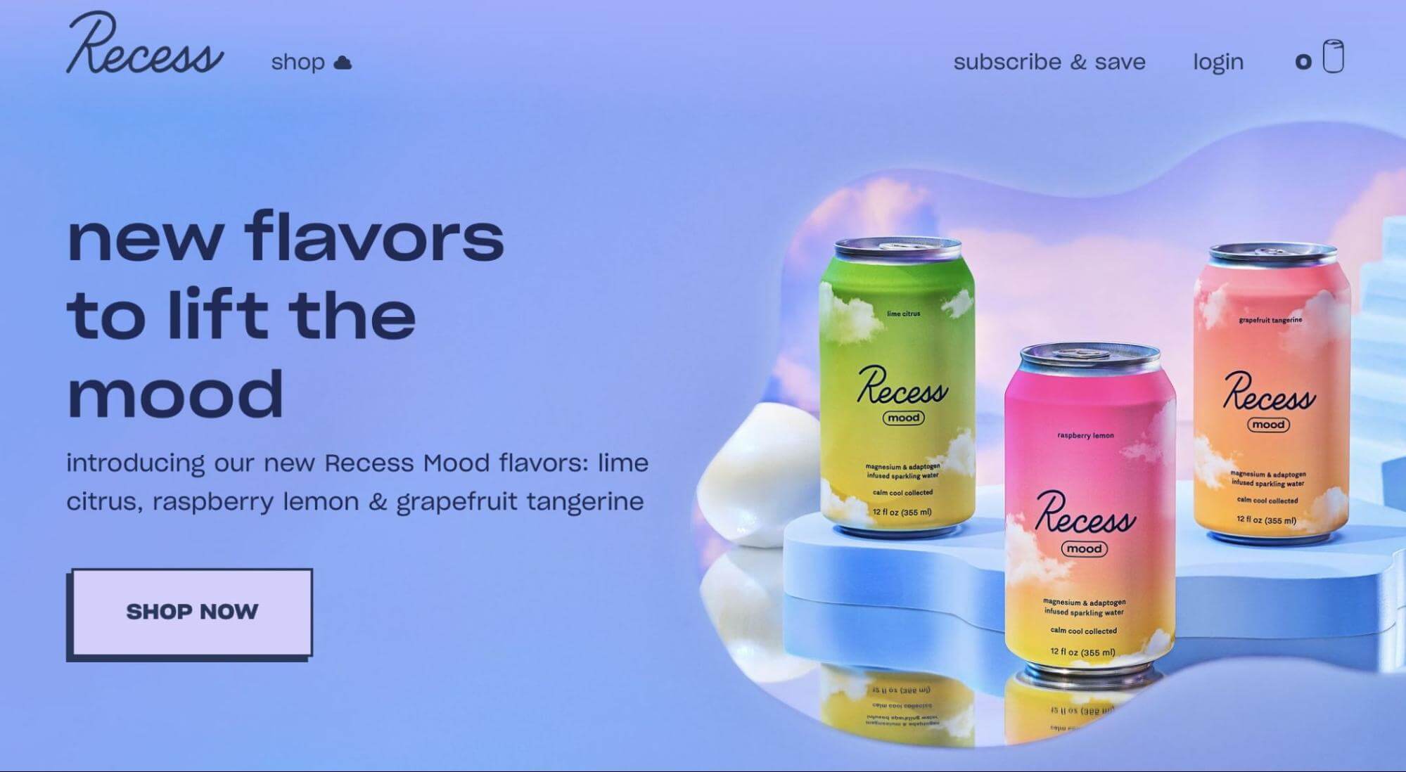
What makes this a good product landing page?
- Recess’s brand is all about lifting your mood. To promote its drinks and powders, the Recess product landing page has a peaceful design and pastel color palette.
- Further aligning with this brand, the background is a blue sky with puffy white clouds. Then, the Recess drinks appear to lift into the sky with motion animations.
- For new customers, Recess directs them to shop for sampler collections. This enables indecisive visitors to try different drinks and find their favorite flavor.
14. Asana
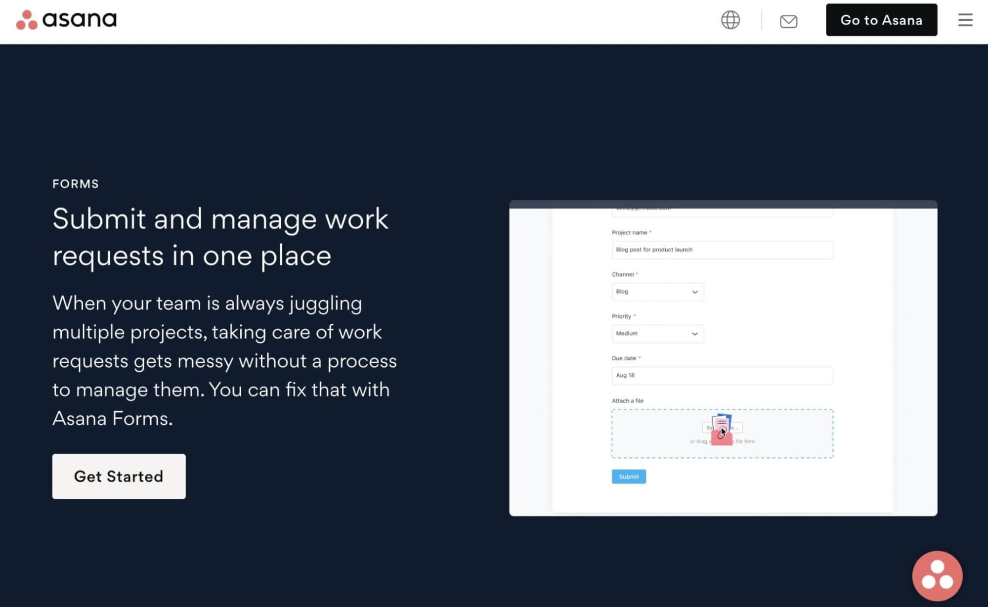
What makes this a good product landing page?
- Asana aims to solve the problem of managing multiple work requests within one team. On its landing page, the company claims that the Asana Forms feature can make this process easier.
- When potential customers visit this page, they’ll see three main benefits of Asana Forms. The tool can enable them to easily organize requests, customize forms, and reduce manual work.
- Many teams will want to kickstart their workflow rather than build them from scratch. Asana includes a list of templates that customers can use for work requests, web design, and IT requests.
15. Monday.com
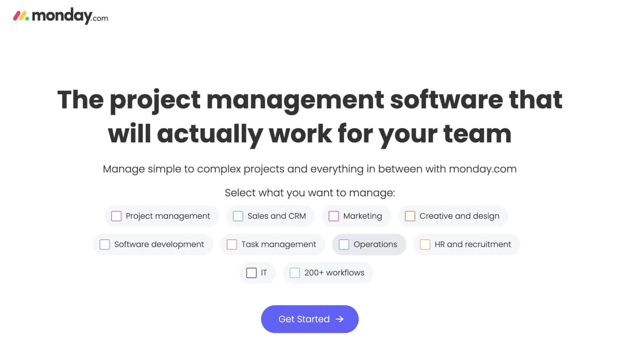
What makes this a good product landing page?
- Another company that knows its audience is Monday.com. On the landing page for its project management software, new customers can choose which projects they’ll be working on.
- Next to specific features, Monday.com includes videos of the main dashboard. These show the product’s ease of use.
- Since this software is supposed to make teams more efficient, Monday.com features actual statistics from a client. Using Forrester as an example, the company shows an increase in Return On Investment (ROI), net value, saved hours, and meeting reduction.
16. Mango Languages

What makes this a good product landing page?
- In contrast with its colorful logo, Mango Languages uses a more minimal design for its product landing page. To match the “Language is an adventure” slogan, there is a video that auto-plays footage from different places and cultures.
- When users want to learn about the language-learning app, they’ll immediately see its high star ratings on Google Play and the Apple Store. Mango Languages even claims to have higher ratings than its competitors.
- Mango Languages also clearly defines how its app works. You’ll start by learning a new language with a tested linguistic methodology. Then, using voice technology, you can test your skills compared to native speakers.
17. ClickUp
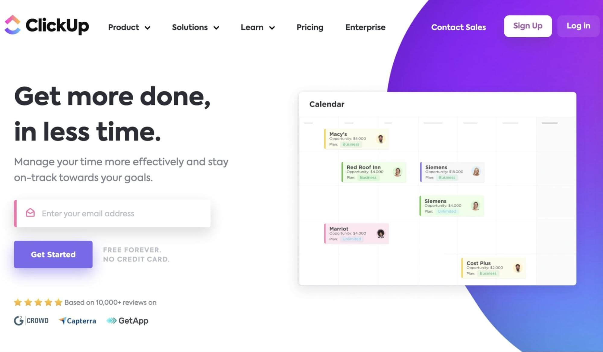
What makes this a good product landing page?
- ClickUp introduces its time-saving project management tool with the effective headline “Get more done in less time”. This is a simple way to summarize the product and solve a problem for customers.
- This product landing page displays the various ways you can view and organize your project calendar.
- Customers can also see specific time-saving features. ClickUp integrates short videos of its dashboard to show how easy it is to create timesheets, bills, milestones, and more.
18. Olipop
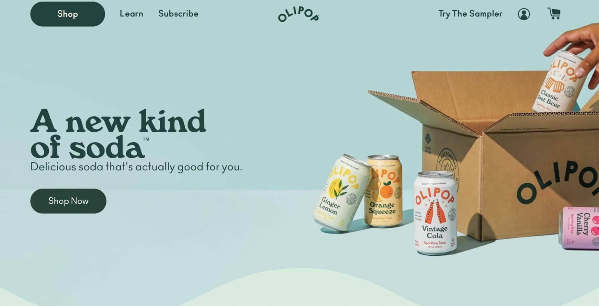
What makes this a good product landing page?
- As a soda manufacturer, Olipop realizes the negative perception of the drink. To combat this, its product landing page features the slogan “Delicious soda that’s actually good for you”.
- To boost brand recognition, Olipop advertises six different flavors in a sampler pack. New visitors can see the nutritional benefits of this product and easily purchase it from the landing page.
- Plus, a table directly compares Olipop with other soda brands. This shows that Olipop has less sugar and calories, which can appeal to a health-conscious buyer.
- Olipop also includes articles from popular news sources to boost the company’s credibility.
19. Tala
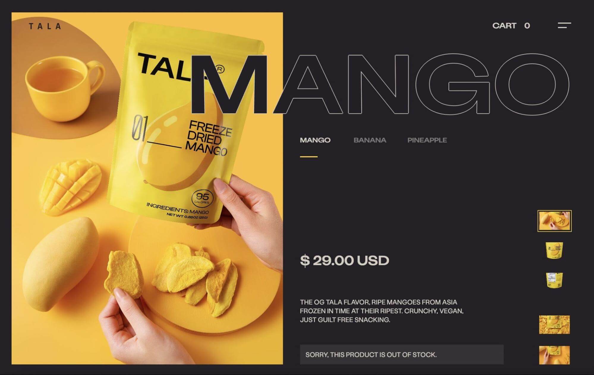
What makes this a good product landing page?
- The landing page for Tala’s mango snacks features a dark background and white text. This draws more attention to the bright yellow product images.
- Tala’s selling point is that it only uses one ingredient. The landing page emphasizes this feature with minimal text.
- New customers can purchase this product directly from the landing page. They can also easily enter their email address to subscribe to the company’s email newsletter.
20. Dollar Shave Club
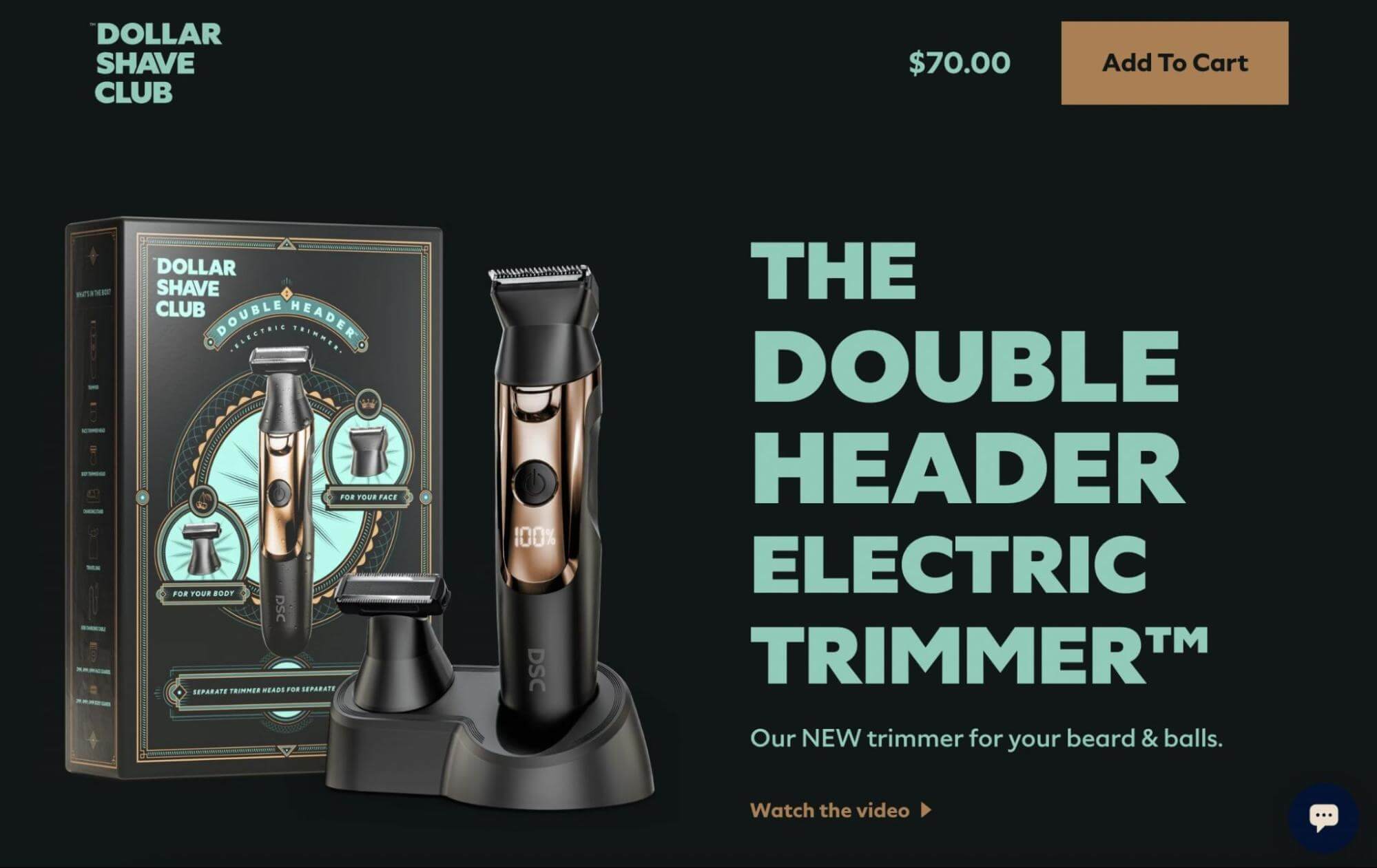
What makes this a good product landing page?
- Dollar Shave Club designed the landing page to match the product itself. Instead of using brand colors, the background, text, and buttons use the new trimmer’s color palette.
- Like the rest of the Dollar Shave Club website, the text has elements of humor and personality.
- To highlight the new features of this product, there is a close-up, revolving animation. It moves as visitors scroll through the list of features.
- Dollar Shave Club also directly compares this product with an older version. This shows new customers that they’re constantly finding new and innovative ways to improve their products.
21. Sandland
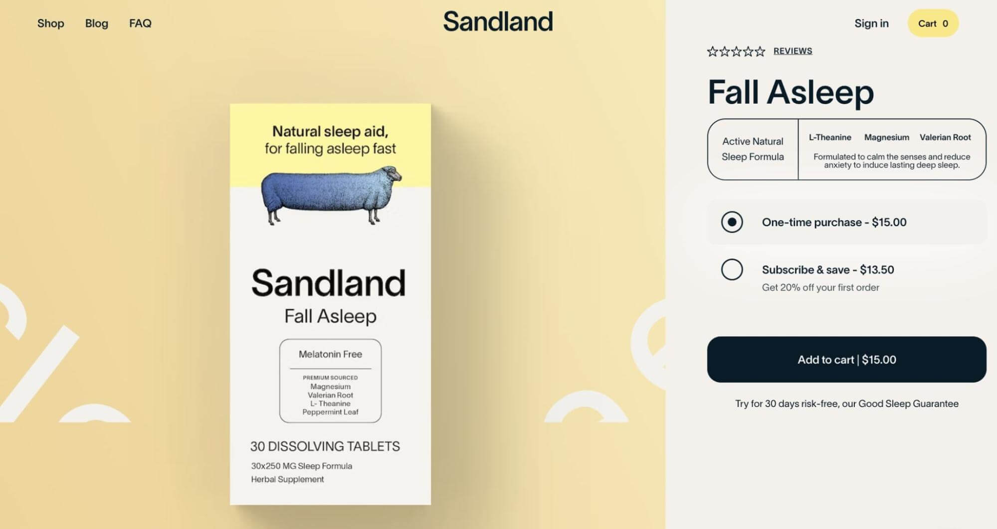
What makes this a good product landing page?
- Sandland’s product landing page features calm, relaxing visuals. To match its sleep-focused brand, there is a slowly moving animation behind the product image.
- The company makes it easy to immediately purchase sleeping tablets and even select a subscribe-and-save option.
- Since people want to be confident that they’re receiving a tested product, Sandland includes the research behind the ingredients. This shows visitors how elements like valerian root and magnesium will improve their sleep.
- Sandland also compares its sleeping pills with other companies, highlighting the product’s main features.
22. Stripe
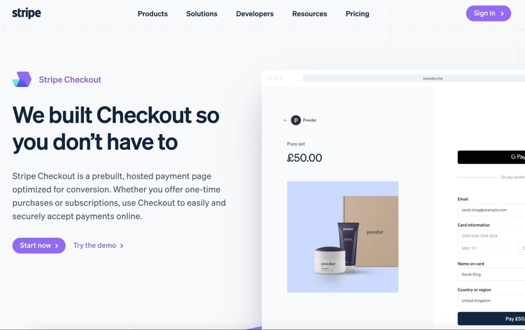
What makes this a good product landing page?
- By adding the headline “We built Checkout so you don’t have to”, Stripe immediately solves a problem for visitors. It introduces Stripe Checkout as a beginner-friendly way to create payment pages.
- Next to each key feature is an animation of the checkout page. Instead of simply reading about the product, visitors will see it in real-time.
- Stripe also breaks down the different pricing options in detail. By making this information transparent, potential customers don’t have to worry about unexpected fees.
23. Beardbrand
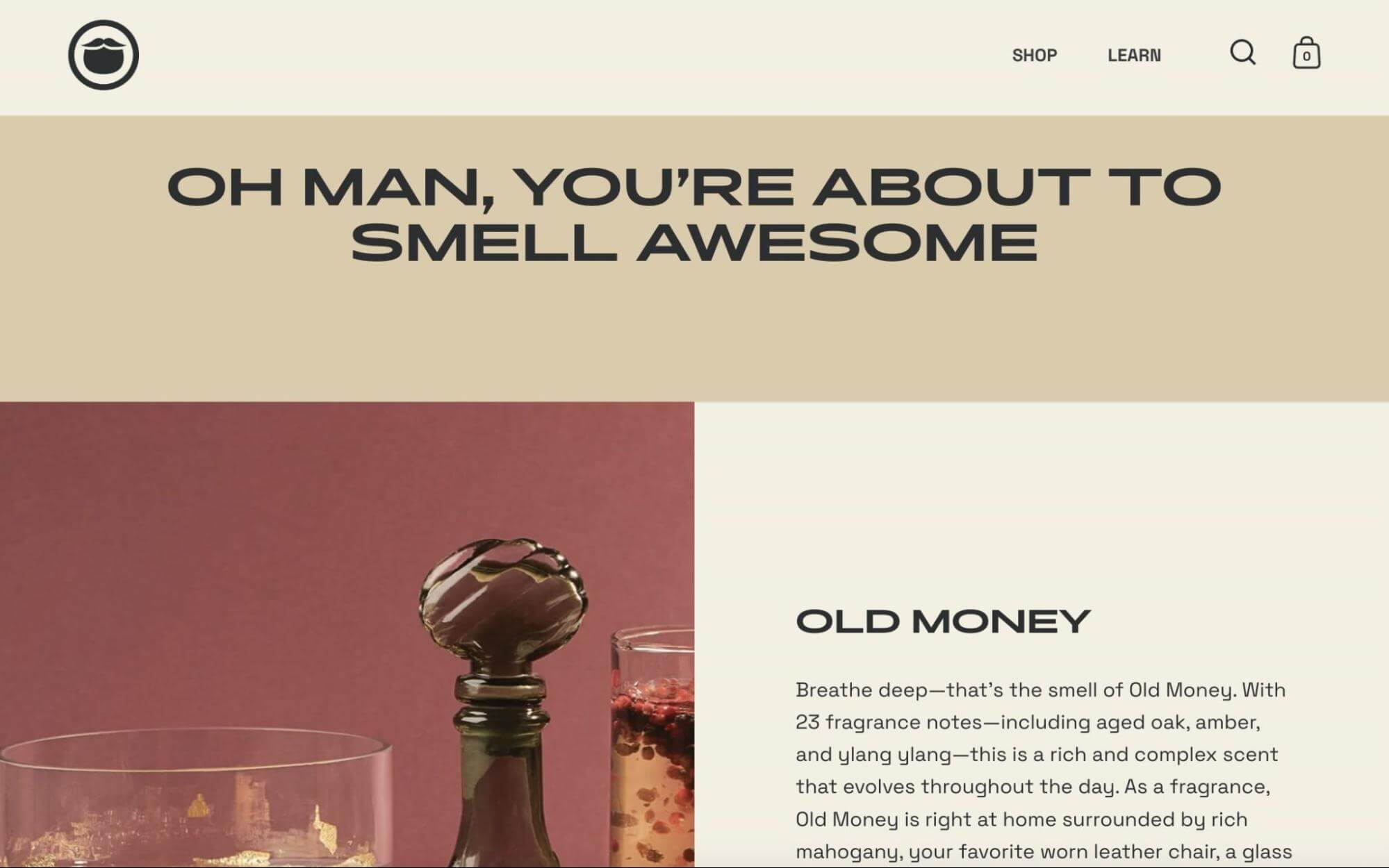
What makes this a good product landing page?
- To advertise its new fragrance line, Beardbrand brings an aura of sophistication and elegance to its product landing page. With an earthy color palette, customers are immediately introduced to the rich Old Money scent.
- It can be difficult to sell cologne online because visitors can’t physically smell it. However, Beardbrand describes each scent’s primary notes and fragrance family. Plus, there are links to cologne samples and custom kits.
- There is a story behind each fragrance. This makes the product landing page much more engaging and fun to read.
24. Hilma
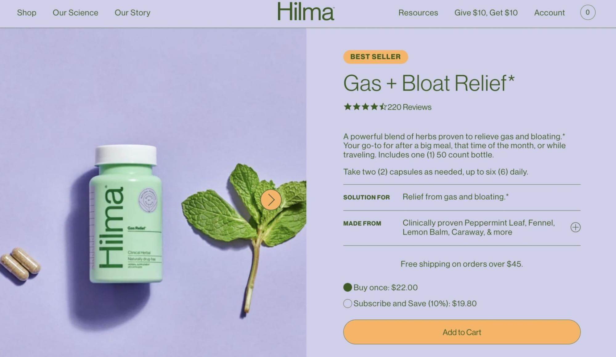
What makes this a good product landing page?
- Every element in the web design is intentionally created to blend with Hilma’s website. The purple background even matches the product’s label. With orange action buttons, any new customers can easily navigate through the product landing page.
- There are icons that represent Hilma’s clean and natural ingredients. These are featured with the company’s calming brand colors.
- In contrast to the included ingredients, Hilma features its zero-tolerance policy. This bright red list shows customers the company’s dedication to healthy lifestyles.
- At the bottom of the page, users can see and filter reviews from previous customers.
25. Memorisely

What makes this a good product landing page?
- Since this landing page advertises a web design bootcamp, it makes sense that it is easy to navigate. The designers include a table of contents that sticks to the side of the page so that users can quickly find the information they need.
- Before users sign up, they can see a detailed schedule of the online courses. By having this information beforehand, customers can fit the live sessions into their daily lives.
- Memorisely is also transparent about pricing. This sets them apart from other course providers and makes learning more accessible.
26. TKEES
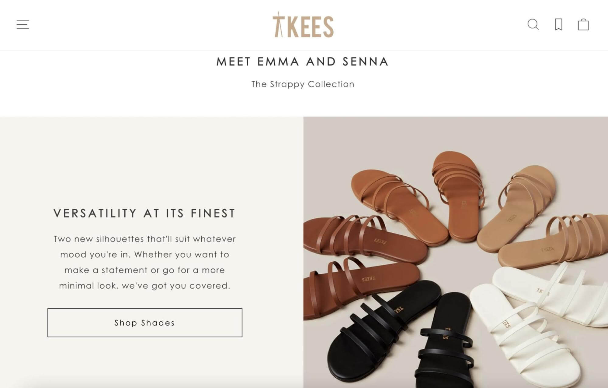
What makes this a good product landing page?
- TKEES introduces its new shoe collection with a product video. It automatically shows visitors clips of the sandals being worn.
- The landing page’s design and layout fit well with the advertised products. Since TKEES promotes timeless and classic shades, the page features a mix of neutral colors.
- Clearly visible action buttons direct users to shop for new products. These link to two different variations depending on the customer’s needs.
27. Behave
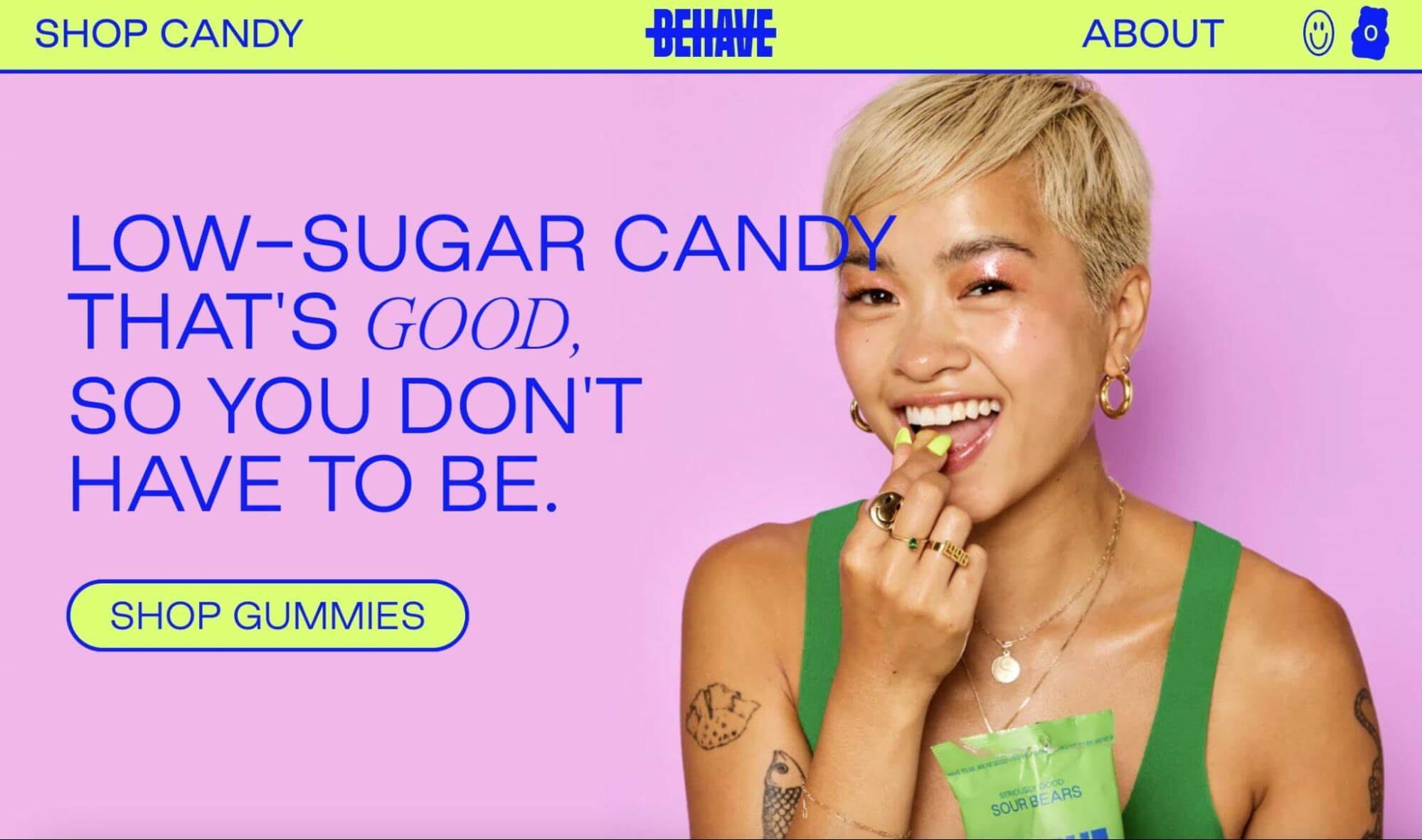
What makes this a good product landing page?
- Rejecting a minimal color scheme, Behave uses vivid shades for this landing page. It reflects the bright-colored gummies and makes the page more unique and engaging.
- Behave primarily uses images and graphics instead of large blocks of text. Limiting any unnecessary information draws more attention to the candy itself.
- There are positive reviews from popular magazines like Business Insider. Since Behave is competing with well-known candy companies, these testimonials can boost brand awareness.
28. Webflow
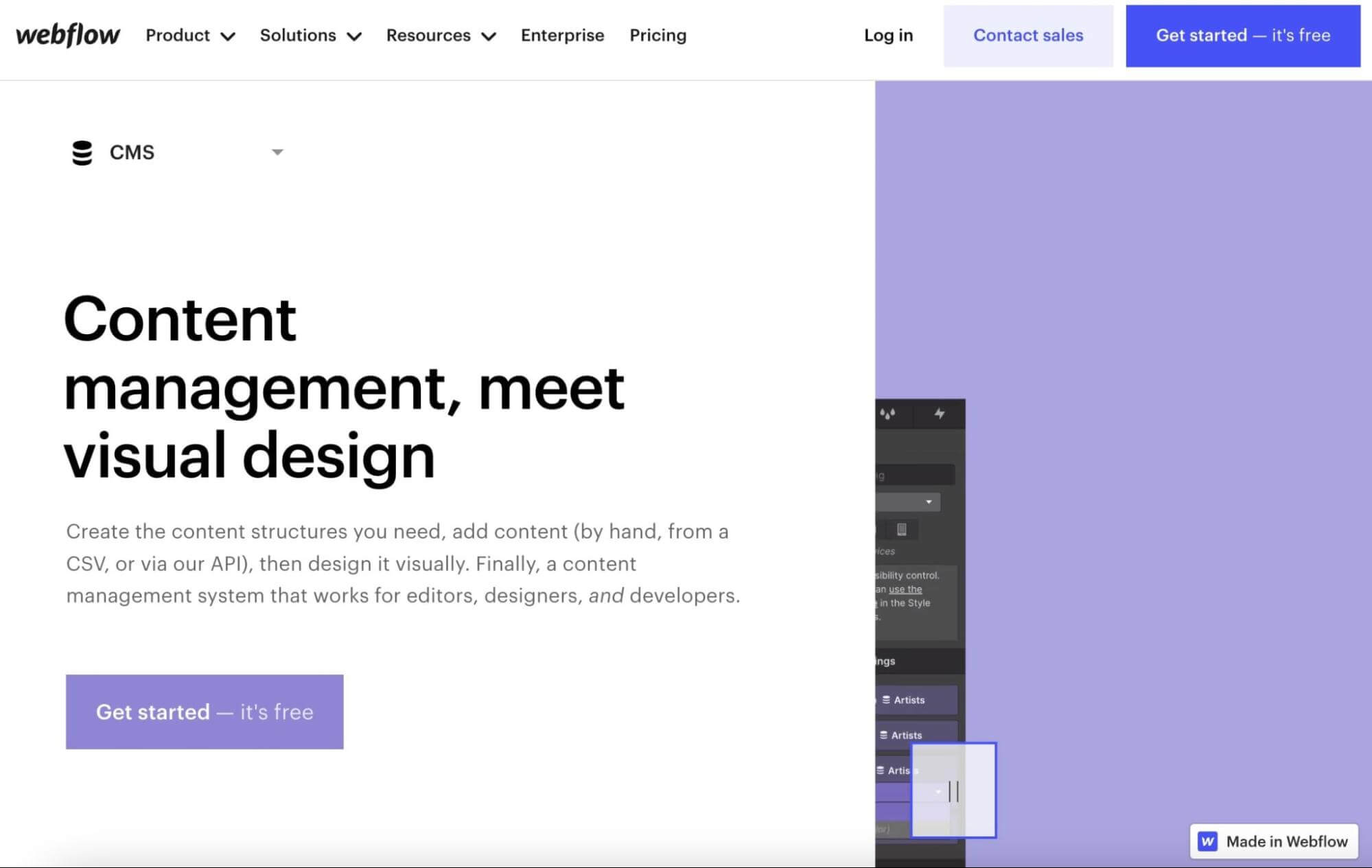
What makes this a good product landing page?
- Webflow introduces its Content Management System (CMS) with a video of different websites built with the software. This is a more interactive element than a simple static portfolio.
- On this product landing page, Webflow defines its target audience. Customers like designers, editors, or developers can find out how the CMS can improve their workflows.
- As visitors scroll, the header sticks to the top of the page. This lets potential customers easily sign up or contact the sales team for more information.
29. Elegant Strand
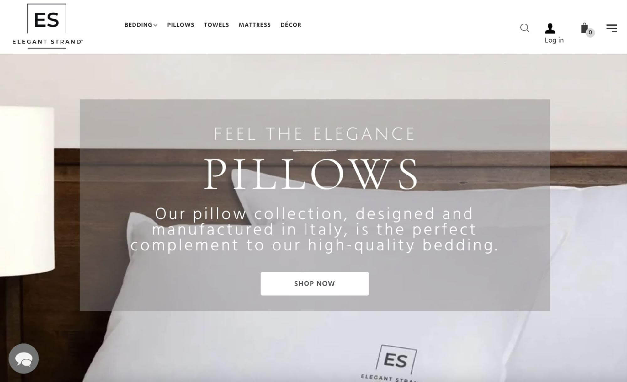
What makes this a good product landing page?
- Elegant Strand sticks to a simple black-and-white color palette to complement its sleeping pillows. This design also makes the landing page more cohesive as a whole.
- In the product description, the pillows are described as hotel-quality. Adding features like goose-down filling and Italian craftsmanship, the products seem more luxurious and high-end.
- Although this landing page aims to advertise Elegant Strand pillows, there is also an option to “Complete your bedroom”. By recommending similar products, the company can increase its average order value.
30. Ugmonk
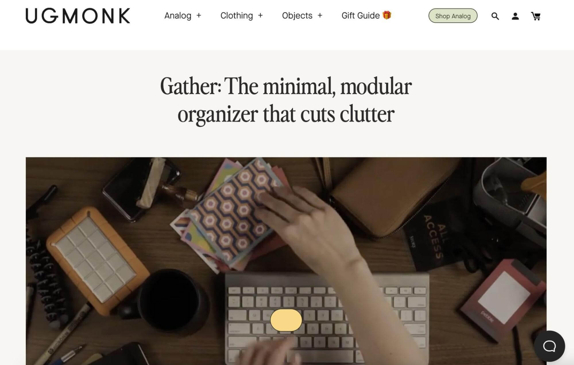
What makes this a good product landing page?
- Since Ugmonk created a desk organizer, it makes sense that its product landing page has a minimalistic design. Just like the product, the layout removes any unnecessary clutter.
- There are many videos of the product in use to advertise its versatility. The clips tell visitors that they can configure the Gather organizer to their unique desk spaces.
- The action statement “Win the battle against clutter” is placed right next to the shop buttons. This element prompts visitors to take control of their desks by purchasing the organizer.
- Unlike other product landing pages, Ugmonk also links to blog posts. Before purchasing the product, potential customers can read about the company’s history.
Create Impressive Product Landing Pages
After developing products or services for your business and building your online store, you’ll want to turn your attention toward creating effective product landing pages. A product landing page will summarize the main features and benefits of your items to new visitors. With the right design, these pages can increase your conversion rate.
For your landing page, you might create aesthetic graphics similar to Apple Airpods Max. Alternatively, you may be inspired by Draggable’s engaging animations. Regardless of your niche, you’ll be able to create a well-designed landing page that aligns with your brand, tone, and target customer.
Once you design your first product landing page, you may not know how to advertise it. At DreamHost, we provide professional marketing services to help you expand your reach and gain new customers!
DreamHost Makes Web Design Easy
Our designers can create a gorgeous website from SCRATCH to perfectly match your brand and vision — all coded with WordPress so you can manage your content going forward.