Your Complete Bootstrap Primer

Let’s say you need to build an analytics dashboard for your business.
You need one that looks professional and works well on different devices, but you don’t have a lot of time to design everything from scratch.
This is where a framework like Bootstrap comes in. It gives you a head start on building responsive websites. Instead of staring at a blank page, you start with a grid and pre-built components. It’s like having a bunch of Legos. You’ve still got to put them together, but the hard part of making all the individual pieces is already done.
If Bootstrap sounds like a good fit for your project, this guide is for you. We’ll take you through everything you need to know to start building websites with Bootstrap.
Let’s get started!
What Is Bootstrap?
Bootstrap is a free, open-source CSS framework that provides a collection of pre-built components, styles, and tools for creating responsive and consistent web designs. Developed by Twitter engineers Mark Otto and Jacob Thornton in 2011, it has since become one of the go-to frameworks for web developers worldwide.
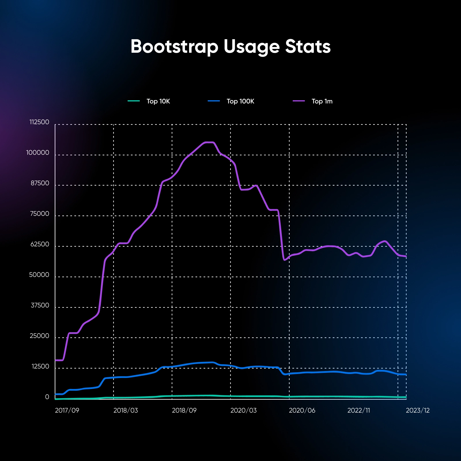
Bootstrap is currently the sixth most popular framework in the top million sites in the JavaScript libraries category.
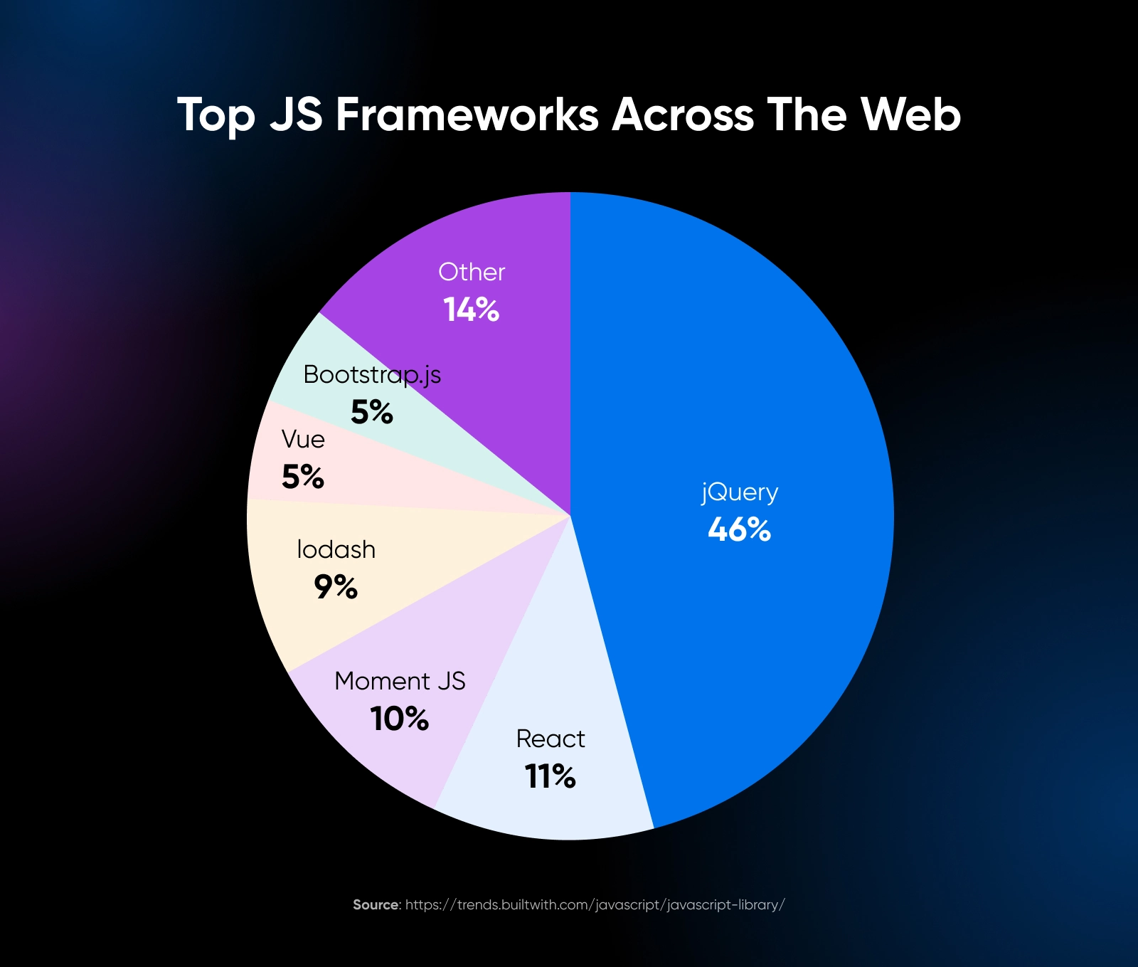
While jQuery and React have received much attention in recent years, over 1.2 million websites worldwide still use Bootstrap.
This framework is mobile-first, meaning it prioritizes the layout and styling for smaller screens and progressively enhances the design for larger screens. Because of this approach, all websites built using Bootstrap are responsive across screen sizes by default.
What Makes Bootstrap Different?
Bootstrap stands out from other CSS frameworks in a few key ways.
Its pre-made components, such as navbars, buttons, forms, and cards, save developers a lot of time. Bootstrap’s responsive grid system makes it easy to create layouts that look good on different screen sizes, from big desktop monitors to small phone screens.
Every component of Bootstrap is customizable, so you can change colors and sizes to fit your specific design. This approach offers several advantages:
- Rapid development: With a wide range of pre-built components and utility classes, developers can quickly prototype and build web pages without spending excessive time on custom CSS.
- Consistent design: Bootstrap enforces a consistent design language across projects, ensuring a cohesive and professional look and feel.
- Responsive by default: Bootstrap’s components and grid system are designed to be responsive, adapting to different screen sizes and devices without the need for extensive custom media queries.
- Cross-browser compatibility: Bootstrap takes care of cross-browser compatibility issues, allowing developers to focus on building functionality rather than worrying about browser inconsistencies.
However, Bootstrap, like any framework, isn’t one size fits all.
Websites built with Bootstrap look similar with different layouts simply because the UI elements are reused. The framework also comes with a lot of CSS and JavaScript that you might not use, which can slow down your website if you’re not careful. There’s also a learning curve in adopting the classes in the framework.
Despite these potential drawbacks, Bootstrap is still a powerful and popular tool for web development, especially if you want to start quickly. Let’s take a look at how to do just that.
Get Content Delivered Straight to Your Inbox
Subscribe to our blog and receive great content just like this delivered straight to your inbox.
Getting Started With Bootstrap
Before we talk about the basics, here are three ways to import the framework:
- Download the compiled CSS and JavaScript files from the official Bootstrap website and link to them in your HTML file.
- Use a Content Delivery Network (CDN) to load Bootstrap from a remote server.
- Install Bootstrap via a package manager like npm if you’re using a build tool.
For simplicity, let’s use the CDN method. Add the following lines inside the <head> tag of your HTML file:
<link rel="stylesheet" href="https://cdn.jsdelivr.net/npm/bootstrap@5.3.3/dist/css/bootstrap.min.css">Then, add the following line just before the closing </body> tag.
<script src="https://cdn.jsdelivr.net/npm/bootstrap@5.3.3/dist/js/bootstrap.bundle.min.js"></script>Note: You need to add these lines for all the following code examples to work.
The Bootstrap Grid System
The Bootstrap grid system is one of its core features, enabling the creation of responsive layouts that adapt effortlessly to different screen sizes.
It is based on a 12-column layout and uses predefined classes to specify how elements should behave at various breakpoints.
Basic Grid
The basic grid is a simple frame with equal-width columns that get taller when the content inside is longer. To create a basic one, start with a container <div> and add rows and columns. Here’s an example:
<div class="container">
  <div class="row">
    <div class="col">
      <div class="bg-light border p-3 text-center">
        <h3>Column 1</h3>
        <p>Lorem ipsum dolor sit amet, consectetur adipiscing elit.</p>
      </div>
    </div>
    <div class="col">
      <div class="bg-light border p-3 text-center">
        <h3>Column 2</h3>
        <p>Pellentesque euismod dapibus odio, at volutpat sapien.</p>
      </div>
    </div>
    <div class="col">
      <div class="bg-light border p-3 text-center">
        <h3>Column 3</h3>
        <p>Sed tincidunt neque vel risus faucibus fringilla.</p>
      </div>
    </div>
  </div>
</div>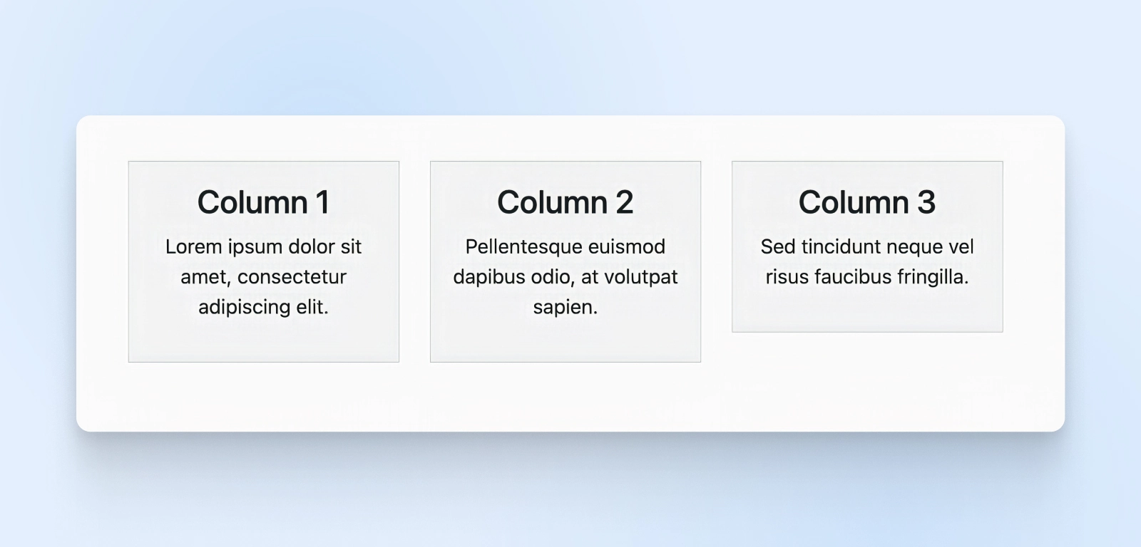
As you see, we’ve created three equal-width columns. Bootstrap handles the padding, spacing between columns, and the alignment.
Grid Column Length
What if you want to control the length of the column? Bootstrap has 12 unit settings that let you decide how wide or how narrow a column can be. For example, to create a row with two columns where the first column takes up eight units and the second column takes up four units, you can do the following:
<div class="container">
  <div class="row">
    <div class="col-8">
      <div class="bg-light border p-3 text-center">
        <h3>Wider Column</h3>
        <p>Nunc vitae metus non velit aliquam rhoncus vel in leo.</p>
      </div>
    </div>
    <div class="col-4">
      <div class="bg-light border p-3 text-center">
        <h3>Narrower Column</h3>
        <p>Fusce nec tellus sed augue semper porta.</p>
      </div>
    </div>
  </div>
</div>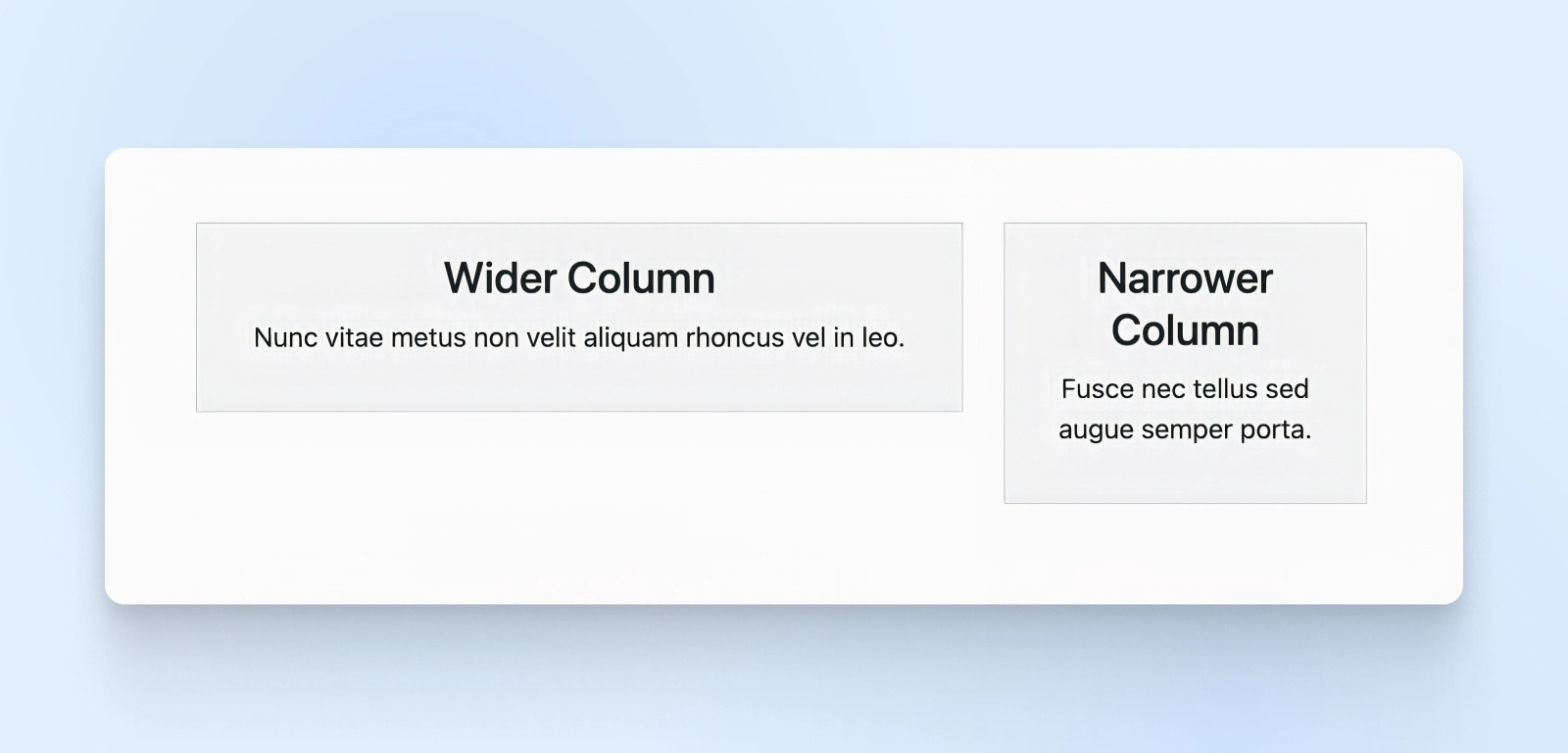
As you may note, there’s a difference in the column classes where the wider column has class col-8 and the narrower column is col-4.
Responsive Column Width
Bootstrap also provides responsive classes that allow you to specify different column widths for different screen sizes. These classes are based on breakpoints, which are predefined screen widths. The available breakpoints are:
- xs (extra small): Less than 576px
- sm (small): 576px and up
- md (medium): 768px and up
- lg (large): 992px and up
- xl (extra large): 1200px and up
- xxl (extra extra large): 1400px and up
To use responsive classes, append the breakpoint abbreviation to the col- prefix. For example:
<div class="container">
  <div class="row">
    <div class="col-md-6">
      <div class="bg-light border p-3 text-center">
        <h3>Column 1</h3>
        <p>Maecenas sed diam eget risus varius blandit sit amet non magna.</p>
      </div>
    </div>
    <div class="col-md-6">
      <div class="bg-light border p-3 text-center">
        <h3>Column 2</h3>
        <p>Donec id elit non mi porta gravida at eget metus.</p>
      </div>
    </div>
  </div>
</div>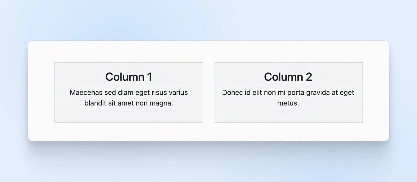
We’ve added the col-md-6 width here, so the columns will automatically resize whenever the screen size is 768px and above.
Bootstrap Components
Bootstrap offers a wide range of pre-built components for assembling user interfaces quickly. These components are responsive and customizable. Let’s explore some commonly used ones.
Buttons
Bootstrap provides well-designed button styles out of the box. To create a button, add the btn class to a <button> or <a> element.
Customize it by adding classes like btn-primary, btn-secondary, btn-success, etc.
<button type="button" class="btn btn-primary">Primary Button</button>
<button type="button" class="btn btn-secondary">Secondary Button</button>
<a href="#" class="btn btn-success">Success Link Button</a>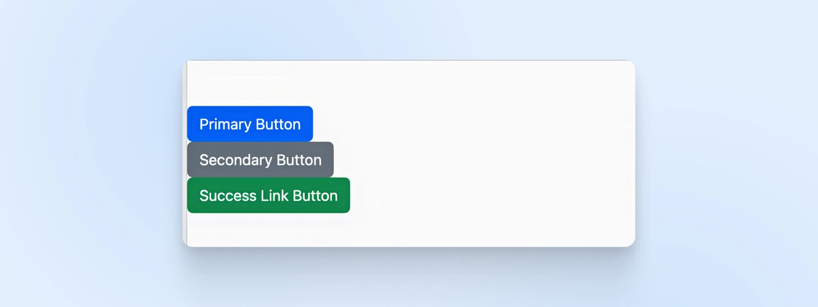
Cards
Cards are versatile containers for content like images, text, and buttons. They provide a structured way to present information.
<div class="card">
  <img src="https://getbootstrap.com/docs/4.5/assets/img/bootstrap-icons.png" class="card-img-top" alt="Card Image">
  <div class="card-body">
    <h5 class="card-title">Card Title</h5>
    <p class="card-text">Some quick example text to build on the card title.</p>
    <a href="#" class="btn btn-primary">Go somewhere</a>
  </div>
</div>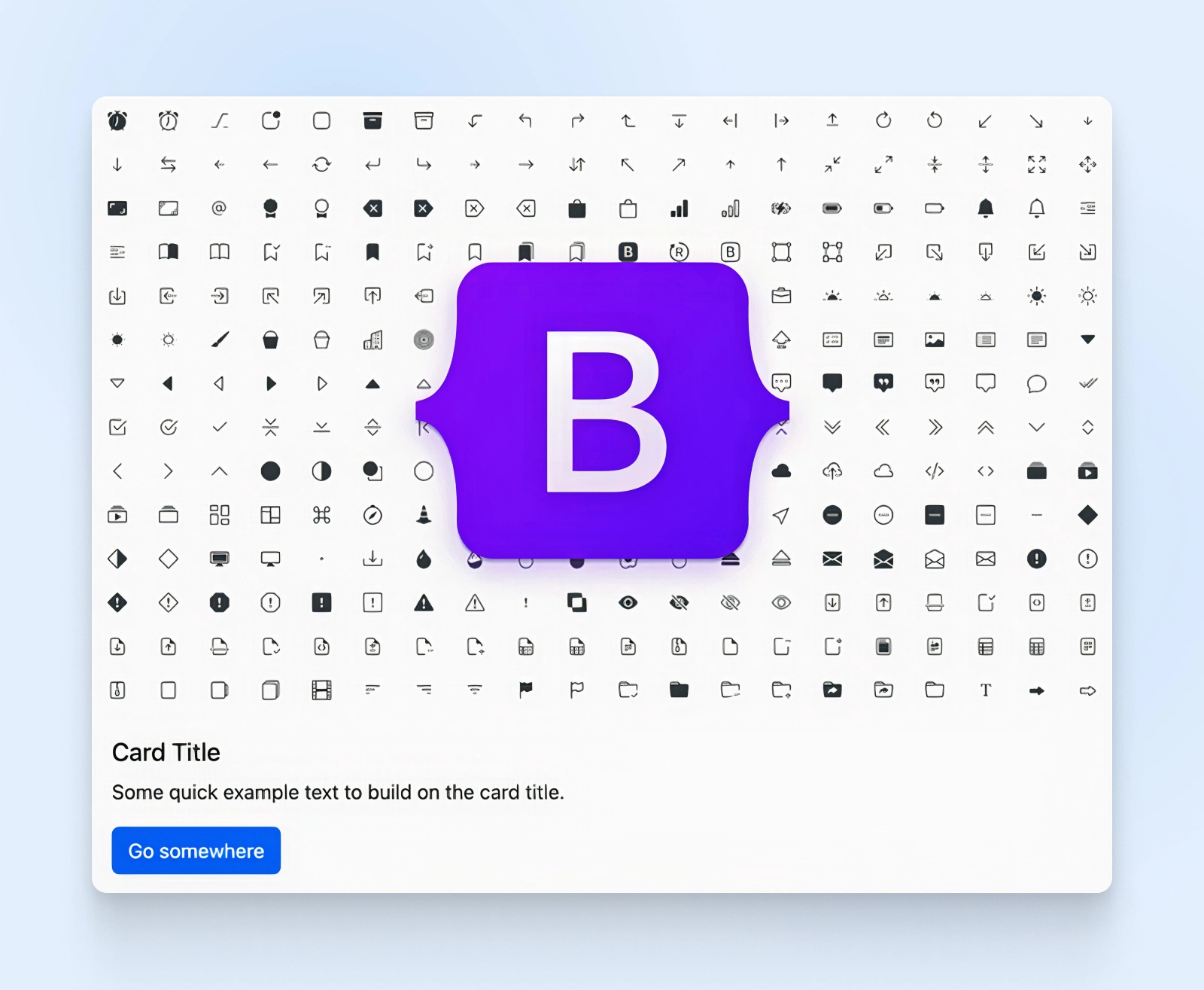
Here, you can see a card with an image at the top, followed by a title, some text, and a button. The card-img-top class positions the image at the top of the card, while the card-body class provides padding and spacing for the content inside the card.
Navbar
The navbar component is a responsive navigation header with branding, links, forms, and more. It automatically collapses on smaller screens and provides a toggler button to expand the menu.
<nav class="navbar navbar-expand-lg navbar-light bg-light">
  <div class="container-fluid">
    <a class="navbar-brand" href="#">My Website</a>
    <button class="navbar-toggler" type="button" data-bs-toggle="collapse" data-bs-target="#navbarNav" aria-controls="navbarNav" aria-expanded="false" aria-label="Toggle navigation">
      <span class="navbar-toggler-icon"></span>
    </button>
    <div class="collapse navbar-collapse" id="navbarNav">
      <ul class="navbar-nav">
        <li class="nav-item">
          <a class="nav-link active" aria-current="page" href="#">Home</a>
        </li>
        <li class="nav-item">
          <a class="nav-link" href="#">Features</a>
        </li>
        <li class="nav-item">
          <a class="nav-link" href="#">Pricing</a>
        </li>
      </ul>
    </div>
  </div>
</nav>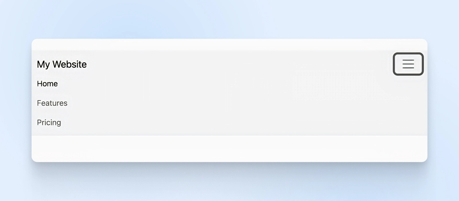
With this simple code snippet, we created a toggle menu button for small screens and a list of navigation links.
The navbar-expand-lg class specifies that the navbar should expand on large screens and collapse on smaller ones. The navbar-light and bg-light classes set the color scheme for the navbar. Compare that to creating the menu with plain CSS, and you’ll understand how many steps Bootstrap saved us.
Forms
Moving on to forms, Bootstrap has a range of form controls and layout options to create interactive and accessible forms.
You can easily style form elements like input fields, checkboxes, radio buttons, and more.
<form>
  <div class="mb-3">
    <label for="exampleInputEmail1" class="form-label">Email address</label>
    <input type="email" class="form-control" id="exampleInputEmail1" aria-describedby="emailHelp">
    <div id="emailHelp" class="form-text">We'll never share your email with anyone else.</div>
  </div>
  <div class="mb-3">
    <label for="exampleInputPassword1" class="form-label">Password</label>
    <input type="password" class="form-control" id="exampleInputPassword1">
  </div>
  <div class="mb-3 form-check">
    <input type="checkbox" class="form-check-input" id="exampleCheck1">
    <label class="form-check-label" for="exampleCheck1">Check me out</label>
  </div>
  <button type="submit" class="btn btn-primary">Submit</button>
</form>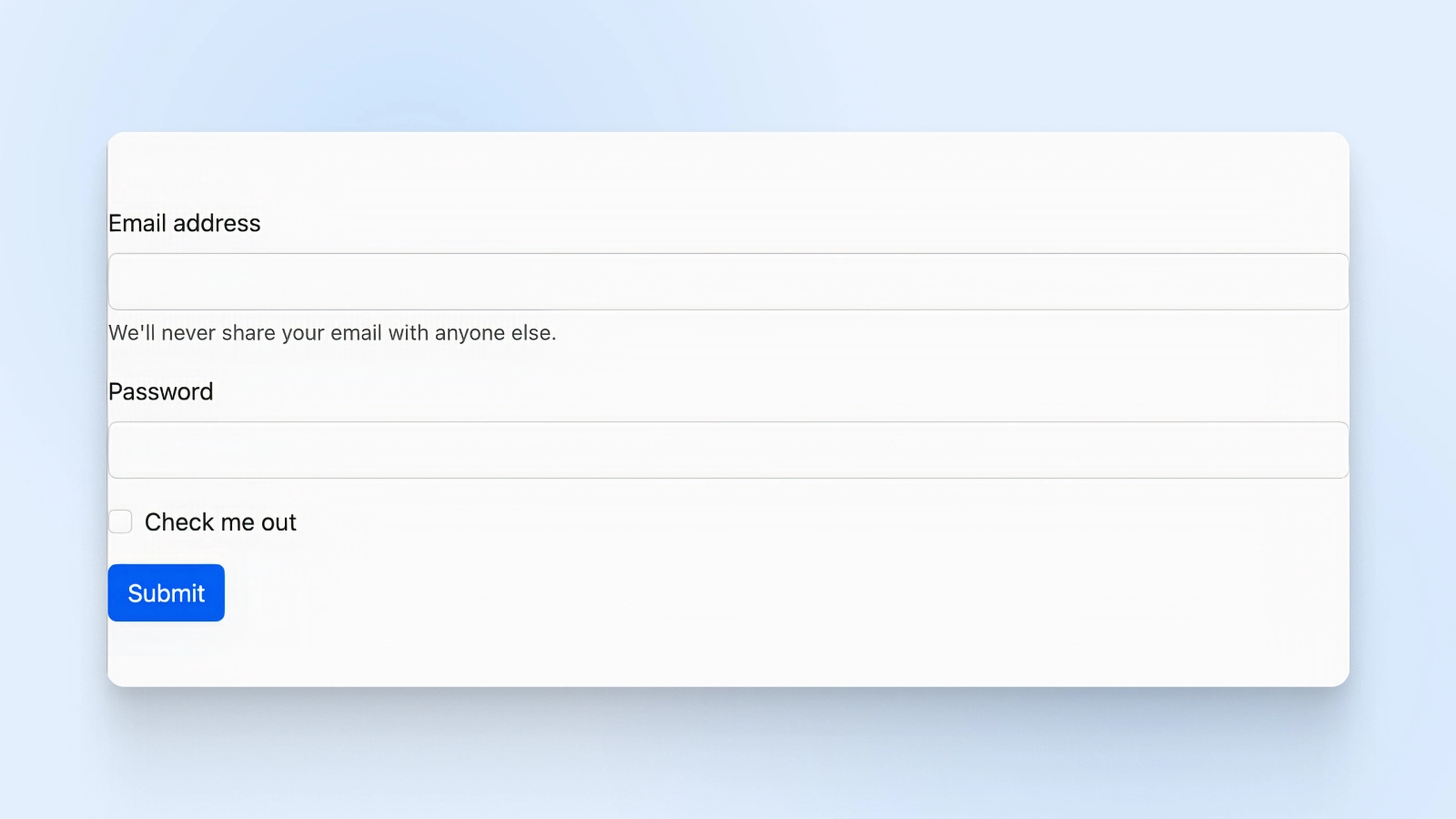
Bootstrap styling has auto-aligned and beautified this form layout from behind the scenes.
This form example includes an email input field, a password input field, a checkbox, and a submit button. The form-label class styles the labels, while the form-control class styles the input fields. The mb-3 class adds a bottom margin to the form groups for spacing.
Creating A Simple Analytics Dashboard With Bootstrap
Now that we’ve covered the basics, let’s put it all together and build a real-world example: an analytics dashboard.
Analytics
Analytics is the field of data interpretation, typically used to help guide strategy. When applied to SEO, this can include keyword research as well as website traffic and competitor analysis. The goal of SEO analytics is to improve a website’s ranking in results pages, and ultimately drive more traffic.
Read MoreImagine you’re building a web application that displays analytics data for a business. The dashboard will include a header with a logo and navigation, a main content area with data, and a footer with additional links.
Let’s break this down into manageable sections using plain language that’s easy to follow.
Setting Up The HTML
First things first, we need to set up our HTML file.
Start by creating a new file and adding the basic structure, like the <!DOCTYPE html> declaration and the <html>, <head>, and <body> tags. In the <head> section, remember to specify the character encoding, viewport, and page title.
Here’s what your HTML should look like so far, including the Bootstrap.css (imported in the <head>) and the Bootstrap.js (imported right before closing <body>) files called into the HTML:
<!DOCTYPE html>
<html lang="en">
<head>
  <meta charset="UTF-8">
  <meta name="viewport" content="width=device-width, initial-scale=1.0">
  <title>Analytics Dashboard</title>
  <link rel="stylesheet" href="https://cdn.jsdelivr.net/npm/bootstrap@5.3.0/dist/css/bootstrap.min.css">
</head>
<body>
  <!-- Your content will go here -->

<script src="https://cdn.jsdelivr.net/npm/bootstrap@5.3.0/dist/js/bootstrap.bundle.min.js"></script>

</body>
</html>
Adding The Header Navigation
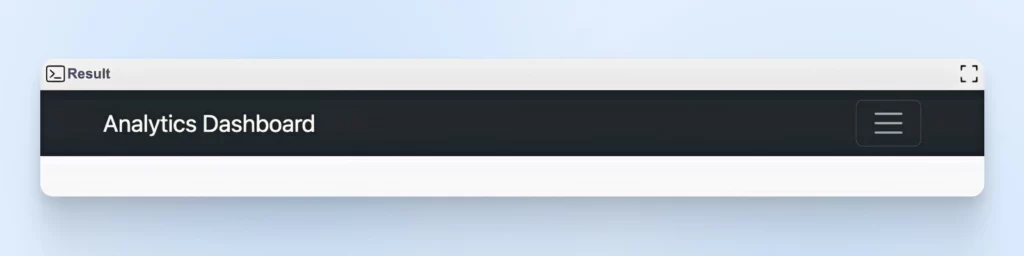
Next up, let’s create a header with a navigation bar. Use the <header> tag, and add a <nav> element inside it. Bootstrap’s navbar component is perfect for this. Then, include a logo and some navigation links, like “Overview,” “Reports,” and “Settings.”
Paste this header code inside the <body> tags
<header>
  <nav class="navbar navbar-expand-lg navbar-dark bg-dark">
    <div class="container">
      <a class="navbar-brand" href="#">Analytics Dashboard</a>
      <button class="navbar-toggler" type="button" data-bs-toggle="collapse" data-bs-target="#navbarNav" aria-controls="navbarNav" aria-expanded="false" aria-label="Toggle navigation">
        <span class="navbar-toggler-icon"></span>
      </button>
      <div class="collapse navbar-collapse" id="navbarNav">
        <ul class="navbar-nav ms-auto">
          <li class="nav-item">
            <a class="nav-link active" href="#">Overview</a>
          </li>
          <li class="nav-item">
            <a class="nav-link" href="#">Reports</a>
          </li>
          <li class="nav-item">
            <a class="nav-link" href="#">Settings</a>
          </li>
        </ul>
      </div>
    </div>
  </nav>
</header>
Here’s what the navigation bar will look like:
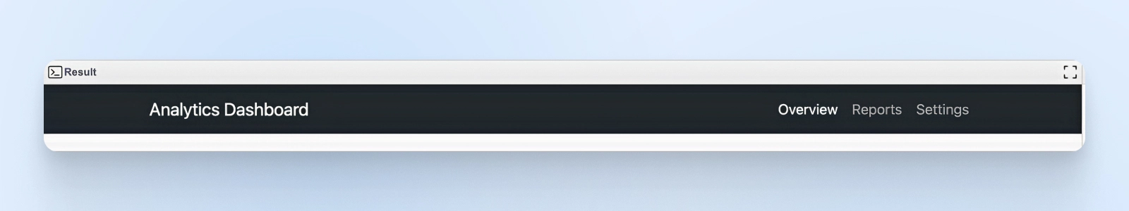
The navbar-expand-lg class makes the navigation responsive, collapsing on smaller screens.
We used navbar-dark and bg-dark to give it a sleek, dark appearance. The navigation links are in an unordered list, and ms-auto pushes them to the right side of the navbar.
Creating The Main Content Area
Time to tackle the main content! Let’s use the <main> tag and create a two-column layout with Bootstrap’s grid system.
The left column will hold cards for displaying charts or graphs, and the right column will have a card showing key metrics. Paste this code right below the </header> closing tag.
To make this example more interactive, let’s add Chart.js to show user metrics. Add this script to your <head>.
<script src="https://cdn.jsdelivr.net/npm/chart.js"></script>Remember, you can skip adding this script and the sample data if you just want to see how Bootstrap works. We’re adding it so the boxes aren’t empty.
Now, let’s write the bootstrap columns to give space for the charts and the data metrics.
<main class="container my-5">
    <div class="row">
      <div class="col-md-8">
        <div class="card mb-4">
          <div class="card-body">
            <h5 class="card-title">Website Traffic</h5>
            <canvas id="trafficChart"></canvas>
          </div>
        </div>
        <div class="card mb-4">
          <div class="card-body">
            <h5 class="card-title">User Acquisition</h5>
            <canvas id="userChart"></canvas>
          </div>
        </div>
      </div>
      <div class="col-md-4">
        <div class="card mb-4">
          <div class="card-body">
            <h5 class="card-title">Key Metrics</h5>
            <ul class="list-group list-group-flush">
              <li class="list-group-item">Total Users: 10,000</li>
              <li class="list-group-item">New Users: 500</li>
              <li class="list-group-item">Bounce Rate: 25%</li>
            </ul>
          </div>
        </div>
      </div>
    </div>
  </main>
Finally, paste this sample data right before the closing body </body> tag. Again, this is not necessary if you only want to see Bootstrap columns in action. We’re adding this sample data for Chart.js to pick up the information and show it on an interactive chart.
<script>
    // Website Traffic Line Chart
    var trafficCtx = document.getElementById('trafficChart').getContext('2d');
    var trafficChart = new Chart(trafficCtx, {
      type: 'line',
      data: {
        labels: ['Jan', 'Feb', 'Mar', 'Apr', 'May', 'Jun'],
        datasets: [{
          label: 'Unique Visitors',
          data: [8000, 9500, 10200, 9800, 11000, 12500],
          borderColor: 'rgba(75, 192, 192, 1)',
          fill: false
        }]
      },
      options: {
        responsive: true,
        scales: {
          y: {
            beginAtZero: true
          }
        }
      }
    });

    // User Acquisition Bar Chart
    var userCtx = document.getElementById('userChart').getContext('2d');
    var userChart = new Chart(userCtx, {
      type: 'bar',
      data: {
        labels: ['Jan', 'Feb', 'Mar', 'Apr', 'May', 'Jun'],
        datasets: [{
          label: 'New Users',
          data: [400, 450, 500, 450, 550, 600],
          backgroundColor: 'rgba(54, 162, 235, 0.6)'
        }]
      },
      options: {
        responsive: true,
        scales: {
          y: {
            beginAtZero: true
          }
        }
      }
    });
  </script>
Putting it all together, you’ll see a beautiful dashboard with a line chart and a bar chart showing growth in our key metrics. The key metrics are also visible on the right side in table format.
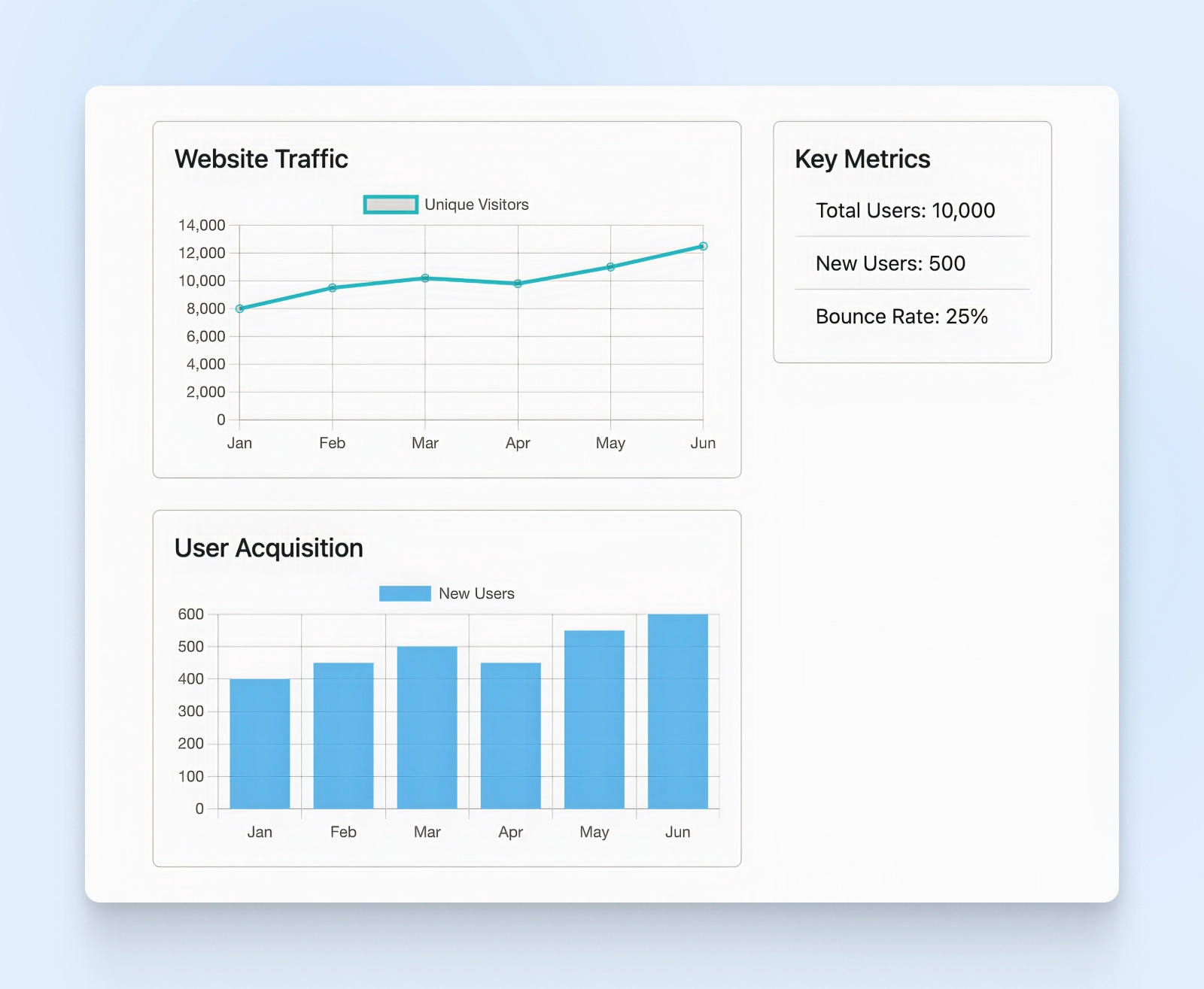
We’ve used the container class to center the content and add some padding. The row class creates a row, and col-md-* classes define the column widths.
The left column (col-md-8) has two cards for charts, while the right column (col-md-4) has a card with key metrics in a list group.
Adding The Footer
Almost there!
Let’s add a footer with some copyright info and links. We’ll use the <footer> tag and Bootstrap’s grid system and spacing utilities to control the layout and padding.
<footer class="bg-light py-3">
<div class="container">
<div class="row">
<div class="col-md-6">
<p>© 2023 Analytics Dashboard. All rights reserved.</p>
</div>
<div class="col-md-6 text-md-end">
<a href="#">Privacy Policy</a>
<a href="#" class="ms-3">Terms of Service</a>
</div>
</div>
</div>
</footer>You should now see this footer added to the button of your dashboard.
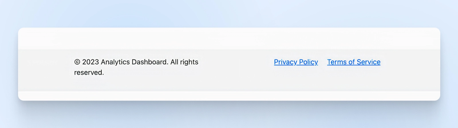
The bg-light class gives the footer a light background color, and py-3 adds vertical padding. We’ve split the footer into two columns: one for the copyright notice and one for the links. The text-md-end class aligns the links to the right on medium-sized screens and larger ones.
Putting It All Together
Let’s combine the code now so you can see the complete picture.
<!DOCTYPE html>
<html lang="en">
<head>
<meta charset="UTF-8">
<meta name="viewport" content="width=device-width, initial-scale=1.0">
<title>Analytics Dashboard</title>
<link rel="stylesheet" href="https://cdn.jsdelivr.net/npm/bootstrap@5.3.0/dist/css/bootstrap.min.css">
<script src="https://cdn.jsdelivr.net/npm/chart.js"></script>
</head>
<body>
<header>
<nav class="navbar navbar-expand-lg navbar-dark bg-dark">
<div class="container">
<a class="navbar-brand" href="#">Analytics Dashboard</a>
<button class="navbar-toggler" type="button" data-bs-toggle="collapse" data-bs-target="#navbarNav" aria-controls="navbarNav" aria-expanded="false" aria-label="Toggle navigation">
<span class="navbar-toggler-icon"></span>
</button>
<div class="collapse navbar-collapse" id="navbarNav">
<ul class="navbar-nav ms-auto">
<li class="nav-item">
<a class="nav-link active" href="#">Overview</a>
</li>
<li class="nav-item">
<a class="nav-link" href="#">Reports</a>
</li>
<li class="nav-item">
<a class="nav-link" href="#">Settings</a>
</li>
</ul>
</div>
</div>
</nav>
</header>
<main class="container my-5">
<div class="row">
<div class="col-md-8">
<div class="card mb-4">
<div class="card-body">
<h5 class="card-title">Website Traffic</h5>
<canvas id="trafficChart"></canvas>
</div>
</div>
<div class="card mb-4">
<div class="card-body">
<h5 class="card-title">User Acquisition</h5>
<canvas id="userChart"></canvas>
</div>
</div>
</div>
<div class="col-md-4">
<div class="card mb-4">
<div class="card-body">
<h5 class="card-title">Key Metrics</h5>
<ul class="list-group list-group-flush">
<li class="list-group-item">Total Users: 10,000</li>
<li class="list-group-item">New Users: 500</li>
<li class="list-group-item">Bounce Rate: 25%</li>
</ul>
</div>
</div>
</div>
</div>
</main>
<script>
// Website Traffic Line Chart
var trafficCtx = document.getElementById('trafficChart').getContext('2d');
var trafficChart = new Chart(trafficCtx, {
type: 'line',
data: {
labels: ['Jan', 'Feb', 'Mar', 'Apr', 'May', 'Jun'],
datasets: [{
label: 'Unique Visitors',
data: [8000, 9500, 10200, 9800, 11000, 12500],
borderColor: 'rgba(75, 192, 192, 1)',
fill: false
}]
},
options: {
responsive: true,
scales: {
y: {
beginAtZero: true
}
}
}
});
// User Acquisition Bar Chart
var userCtx = document.getElementById('userChart').getContext('2d');
var userChart = new Chart(userCtx, {
type: 'bar',
data: {
labels: ['Jan', 'Feb', 'Mar', 'Apr', 'May', 'Jun'],
datasets: [{
label: 'New Users',
data: [400, 450, 500, 450, 550, 600],
backgroundColor: 'rgba(54, 162, 235, 0.6)'
}]
},
options: {
responsive: true,
scales: {
y: {
beginAtZero: true
}
}
}
});
</script>
</body>
<footer class="bg-light py-3">
<div class="container">
<div class="row">
<div class="col-md-6">
<p>© 2023 Analytics Dashboard. All rights reserved.</p>
</div>
<div class="col-md-6 text-md-end">
<a href="#">Privacy Policy</a>
<a href="#" class="ms-3">Terms of Service</a>
</div>
</div>
</div>
</footer>
</html>As you can see, the responsive navigation bar is at the top, with the charts directly below it. Bootstrap handles the padding and spacing between grid items, which you can see on your dashboard metrics.
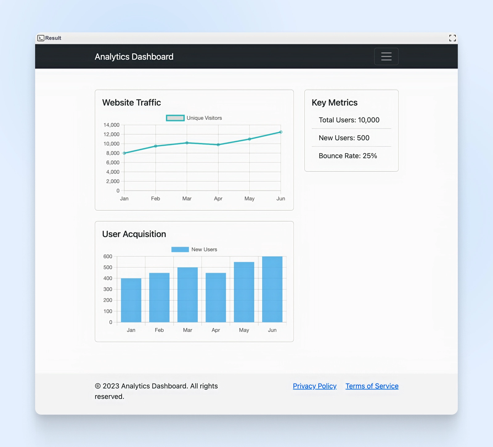
At the bottom of the screen is the footer with the Privacy Policy and Terms of Service links.
You’ve just created a simple analytics dashboard using Bootstrap. But Bootstrap has tons of components we haven’t even touched upon yet. Be sure to explore the Bootstrap components library to find reusable components for your future projects.
A Toolkit For Responsive Web Design
Bootstrap is a popular framework that helps web developers quickly create responsive websites. It has a grid system, pre-built components, and customization options, making it easier to develop websites that look good on different devices.
Developers with all levels of experience use Bootstrap. It’s pretty easy to learn, but it’s powerful enough to handle big projects. There’s a big community of Bootstrap users for support and lots of resources to help you learn the framework.
When you build a Bootstrap site, you need a good hosting company, too. DreamHost has a virtual private server (VPS) option that works perfectly. It’s flexible and can handle different needs as your Bootstrap site grows.
Why not give Bootstrap a shot and see what you can create? With the right tools and a hosting plan from a company like Dreamhost, you can make responsive websites in no time.
Create a Website for All
We make sure your website is fast and secure so you can focus on the important stuff.
